The Blue Ridge Makers’ Inn Website Design
The Blue Ridge Makers Inn is a fictitious boutique bed and breakfast made for artists and creators. The inn is located in the heart of Asheville, a city in North Carolina known for its bustling art community.
The Blue Ridge Makers Inn is a fictitious boutique bed and breakfast made for artists and creators located in the heart of Asheville, a city in North Carolina known for its bustling art community.
The inn is not just a place to eat and rest- it offers a collaborative space for artists to gather and immerse themselves creatively while benefiting from being in the artistic heart of Asheville, NC. The inn celebrates Asheville’s art community by connecting travelers with local artists and their creative practice and the surrounding landscape.
Project Duration:
January–April 2025
Components:
User Interface
Table of Contents
- Audience and Goals– Target Audience, User Pain Points, Design Goals
- Key Design Decisions– Designing a Creatively-Inspired Visual System, Using Familiar Interaction Patterns for Ease of Use, Establishing Clear Information Hierarchy, Designing for Approachability and Inclusivity, Designing an Adaptive Experience Across Devices
- Design Process– Drawn Wireframes, Digital Wireframes, Low-Fidelity Prototype, Usability Study Findings, Low-Fidelity Prototype Iterations, High-Fidelity Prototype Iterations
- Final Website– Site Map, High-Fidelity Prototype
- Going Forward– Takeaways, Next Steps
AUDIENCE AND GOALS
Target Audience
The Blue Ridge Makers’ Inn targets travelers seeking an immersive creative experience, from practicing artists interested in staying at an art retreat and B&B in Asheville, North Carolina, to curious Asheville tourists who want to explore new hobbies and activities. These individuals are interested in and willing to pay more for the curated experience the inn offers.
Research revealed two separate personas with different mindsets:
- Creative professionals looking for structured programming and specific workspaces.
- Non-artists or beginners who are intrigued by the inn’s offerings but unsure if they belong there.
“How does this retreat compare to the other retreats that I’ve looked at? What kind of working spaces are there? How much structure does it have? What is included in the price listed?”
Persona 1: Alex, Visual Artist and Art Professor
“This place looks amazing, but is it for someone like me? I don’t want to feel out of place when I’m there. Will I feel welcome at The Blue Ridge Makers’ Inn even though I’m not an artist? Also, is its extra cost over a traditional hotel worth it?”
Persona 2: Gabriella, Asheville Tourist
AUDIENCE AND GOALS
User Pain Points
Across both persona groups, users expressed uncertainty around the experience and logistics of staying at a creative bed-and-breakfast.
AUDIENCE AND GOALS
Design Goals
The website was designed to directly address these concerns.
KEY DESIGN DECISIONS
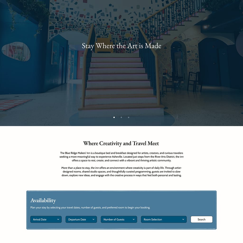
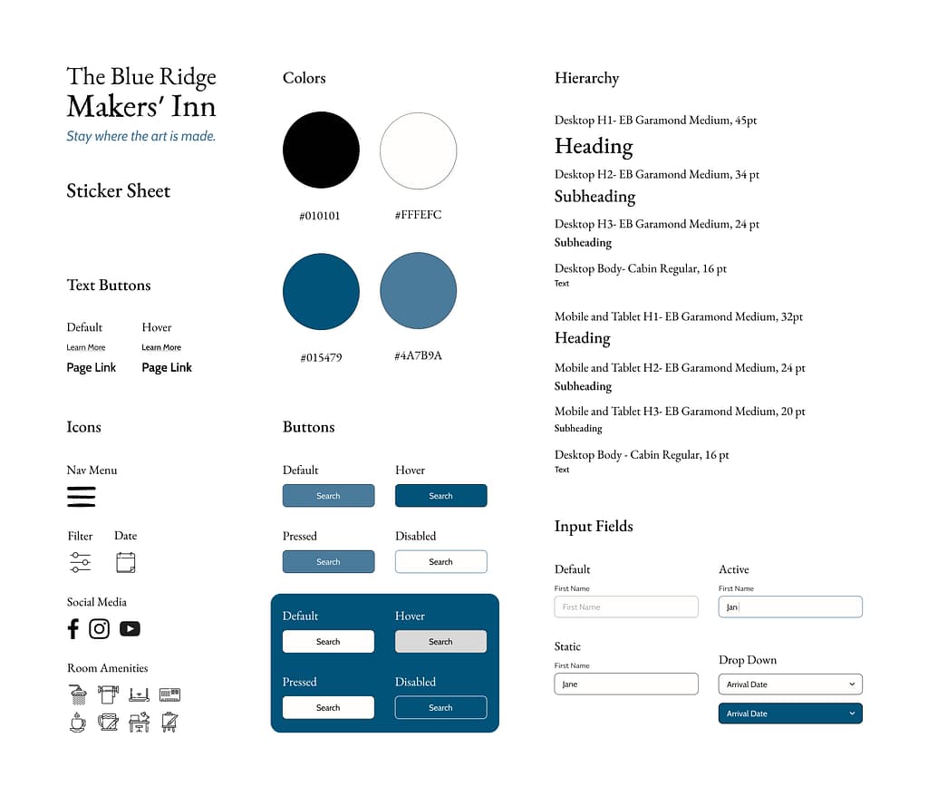
Designing a Creatively-Inspired Visual System
The visual design draws from traditional crafting and printmaking aesthetics to reflect the inn’s focus on creating.
- Typography:
A traditional serif typeface (EB Garamond) was used for headings, while a clean sans-serif for the body text (Cabin) ensures readability. Cabin was specifically chosen because of how friendly and inviting it feels. - Color Palette:
A limited palette of mid-toned and deep blue, black, and off-white creates a calm and grounded atmosphere. The off-white was chosen for its warmth and similarity to the color of a sketchbook page.
KEY DESIGN DECISIONS
Using Familiar Interaction Patterns for Ease of Use
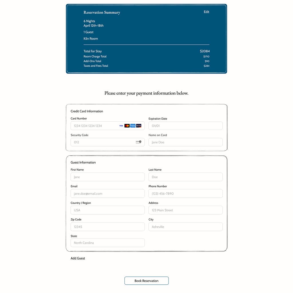
The interface prioritizes usability and minimizes the cognitive load of users by using recognizable UI patterns.
- Standard input fields and dropdowns were used for booking interactions.
- Clearly defined button states (default, pressed, disabled) were implemented.
- Simple iconography was chosen for navigation, amenities, and filters. Any icons users may be unfamiliar with are accompanied by descriptive text.
KEY DESIGN DECISIONS
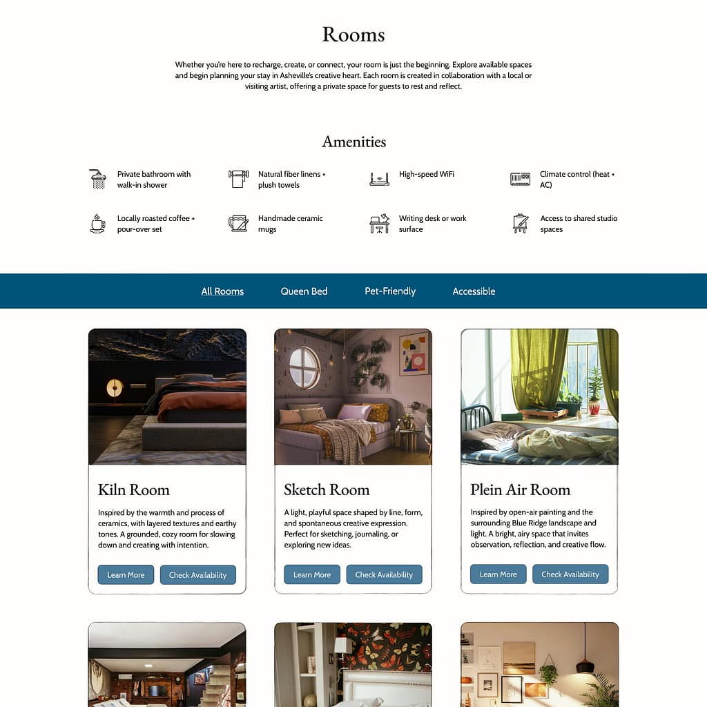
Establishing Clear Information Hierarchy
Users wanted clarity around what the inn’s pricing includes and how it compares to competitors.
- A structured typographic system (H1–H3 + body) ensures consistency across pages and devices.
- Key information (pricing, amenities, experiences) isn’t buried in the website and can be found easily.
- Content is broken into digestible sections rather than long paragraphs for readability.
KEY DESIGN DECISIONS
Designing for Approachability and Inclusivity
The interface was designed to feel welcoming and unintimidating for all users.
- Generous spacing and simple layouts reduce cognitive load.
- Clear typography hierarchy makes content easy to scan.
- Soothing colors with high color contrast ratios create an inviting tone for everyone, including users with limited vision.
- Plain, simple language and consistent navigation were used to ensure that the content is accessible for users with cognitive disabilities.

KEY DESIGN DECISIONS
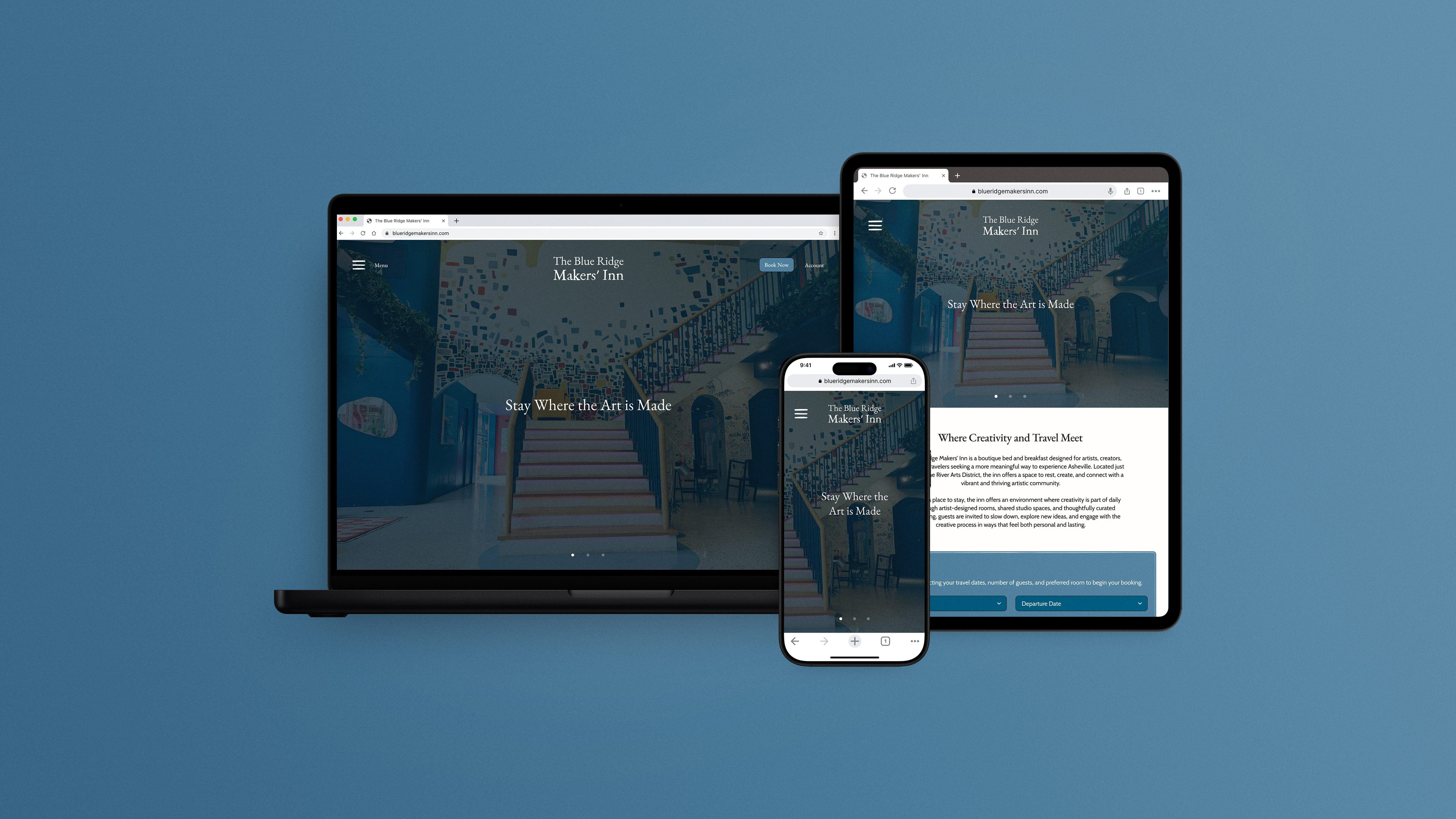
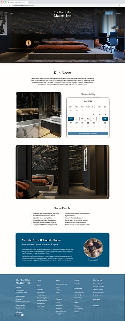
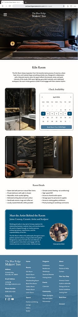
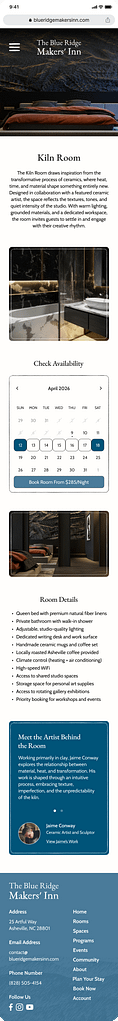
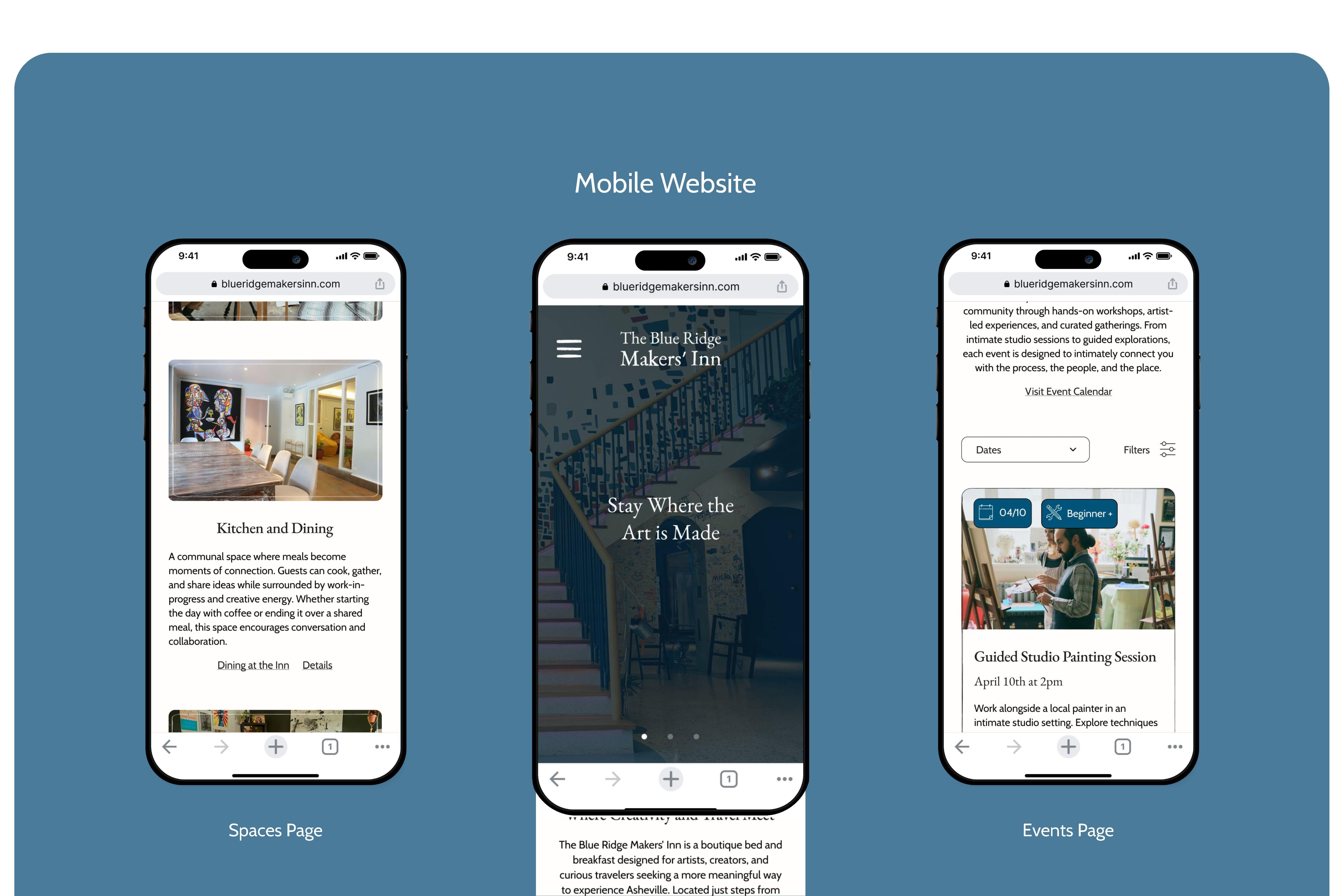
Designing an Adaptive Experience Across Devices
The website was designed to provide a consistent and usable experience across mobile, tablet, and desktop devices.
Across devices,
- Heading and body text sizes were adjusted for readability.
- Spacing and layout grids were adjusted, and content placement was adapted.
- UI components (buttons, forms, images, cards) scale appropriately.
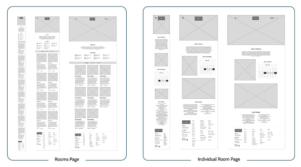
DESIGN PROCESS
Drawn Wireframes


Drawing wireframes allowed for rapid iteration of the website’s layout and exploration of how the site would appear on different devices. Wireframes were chosen that had the most intuitive navigation across screen sizes and best met the user’s needs.

Chosen Desktop Wireframes

Chosen Tablet Wireframes

Chosen Mobile Wireframes
DESIGN PROCESS
Digital Wireframes
The chosen wireframes were then copied into Figma and adapted into a modifiable digital format. The layout was further realized, and key elements were added such as the footer, forms, accordion menus, buttons, and placeholder text.


DESIGN PROCESS
Low-Fidelity Prototype
The layout and user flow were finalized during the creation of the low-fidelity prototype.
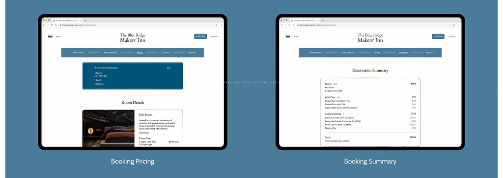
Main User Flow:
- Go to the Rooms Page and Select a Room
- Look at the Room’s Details and Check Availability
- Select Book Room and Go Through the Reservation Process:
- Search for a Room
- View Pricing and Available Add-Ons
- Enter Payment Information and Checkout
Figma Prototype Link:
DESIGN PROCESS
Usability Study Findings
The first usability study was conducted on the low-fidelity prototype and had three participants. The second usability study was conducted on the high-fidelity prototype and had six participants.
Round 1 Findings
Round 1 Findings
- The navigation menu takes up too much space horizontally.
- Filters are needed during the room search / room selection process.
Round 2 Findings
Round 2 Findings
- Touch targets need to be enlarged in some areas.
- Use of centered text should be lessened for readability.
- Add functionality to the directional carousel buttons and home page room search feature.
- Increase the size and weight of footer text for easier readability and scannability.
- Increase the weight of the selected page text in the reservation progress bar.
- Move the hamburger menu icon further left to align with the navigation menu’s close button.
- Switch the room availability calendar colors for accessibility.
- Fix missing links.
DESIGN PROCESS
Low-Fidelity Prototype Iterations
Pain Point:
“Is there a simpler way to do all this? Great work, it takes up a lot of space though.”
Solution:
Decreased the width of the navigation menus from 667px to 417px (tablet) and 770px to 504px (desktop).

Pain Point:
“Consider adding filters for specific amenities or categories like price.”
Solution:
Added a sort-by dropdown menu and filter-by menu to the room selection page that the user visits during the reservation process.

DESIGN PROCESS
High-Fidelity Prototype Iterations
Pain Point:
“This is consistent with your branding in terms of color, but may cause issues with readability, especially the smaller gray numbers. What if you reversed the color scheme? Perhaps the available or selected dates could be in white with a blue shape?”
Solution:
Switched the colors of the availability calendar, making the background off-white, selected days dark blue, and the book room button light blue.

Pain Point:
“This menu placement feels off. I like the choice of a hamburger icon/vertical slide-out style menu, but I think the icon placement seems like it could have better placement. A tad to the left mostly.”
Solution:
Moved the hamburger menu icon further left and the book now button and account page text further right (for consistent margins). This change allows the icon to align with the navigation menu’s close icon.

Pain Point:
“This footer is very detailed, consider using bigger font for the main navigation pages or a smaller font for the subpages, its a lot to read at once and it is not easy to look at immediately.”
Solution:
Increased the size and weight of the text for the main pages and headings in the footer.

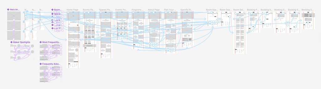
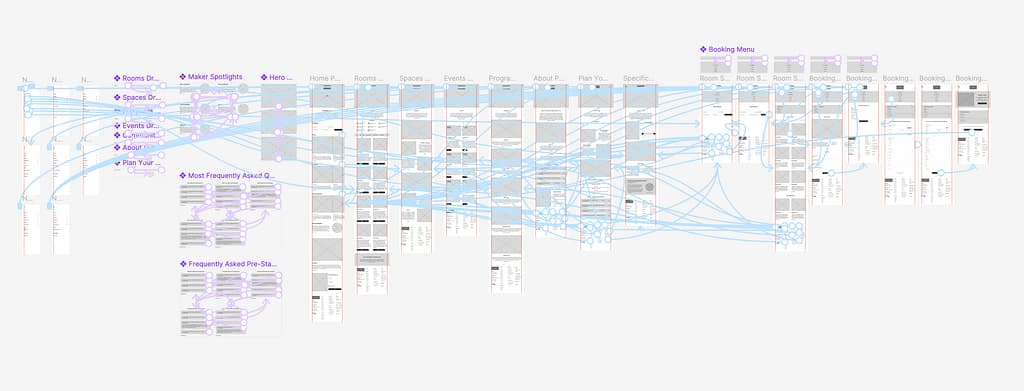
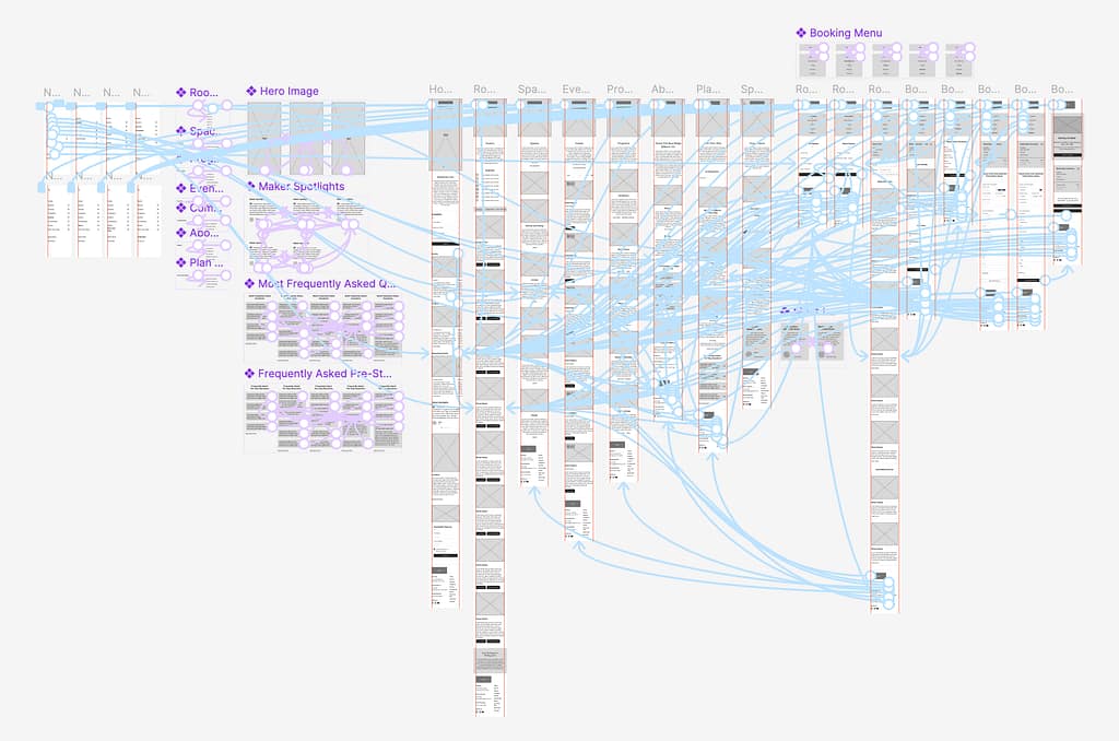
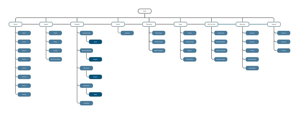
FINAL WEBSITE
Site Map
Outlines the Hierarchy of the Website


GOING FORWARD
Takeaways
User Feedback:
“After reviewing your site, I like it a lot, although I think of it less as a bed and breakfast but as a building that runs workshops and activities and happens to have bedrooms and some things I’d expect in a B&B. I overall like your color scheme and font pairings…. I think you have made some great choices throughout on the imagery choices. Great job!”
What I Learned:
This project deepened my experience with utilizing the design-thinking framework to develop human-centered design solutions. It advanced my skills in Figma and gave me practice with creating adaptive website designs optimized for desktop, tablet, and mobile devices.
GOING FORWARD