Kindred App Design
Kindred is a fictitious online dating app that allows its users to connect with like-minded individuals who have shared hobbies, interests, lifestyles, careers, or beliefs.
Kindred is a fictitious online dating app that allows its users to connect with like-minded individuals who have shared hobbies, interests, lifestyles, careers, or beliefs.
Its target audience is Individuals who are 18 or older, are searching for a relationship, and are interested in connecting with like-minded individuals.
Project Duration:
October–April 2026
Components:
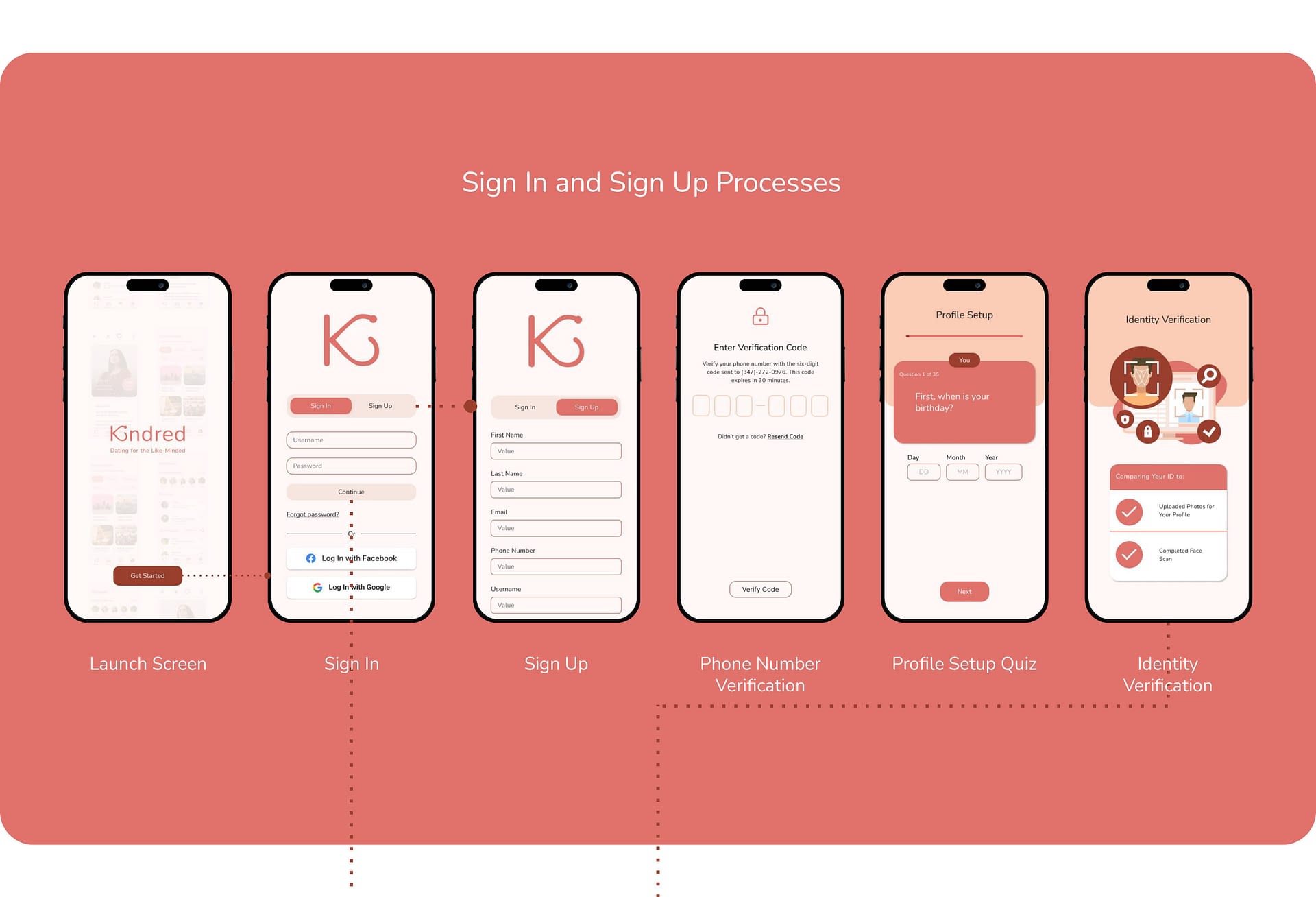
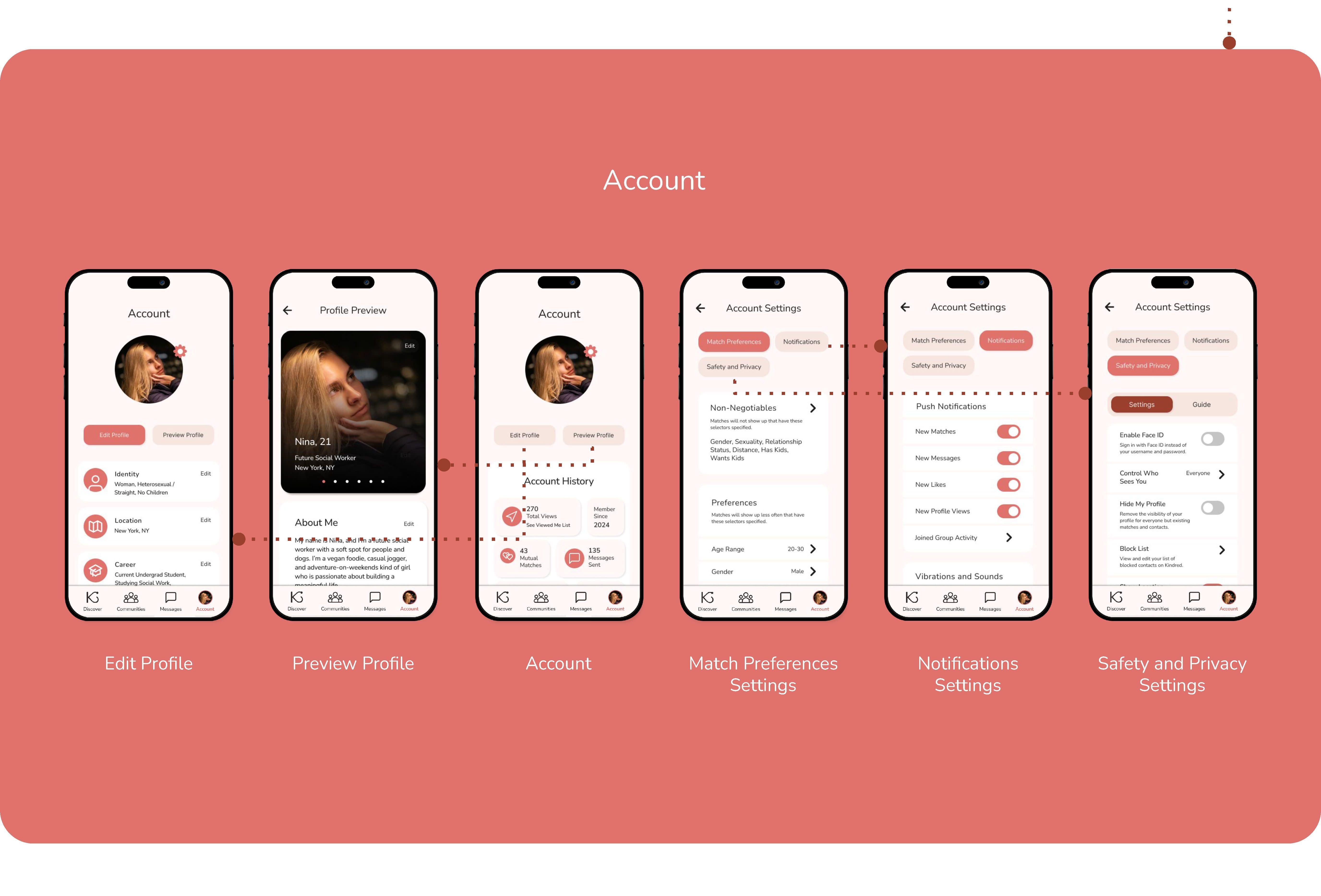
User Interface
Table of Contents
- Problem and Opportunity– The Problem, User Pain Points
- Research and Key Insights– User Journey Maps, Usability Study Findings, Product Survey Findings, Second Unmoderated Usability Study Findings
- Design Iterations– Primary User Flow, Paid User Flow
- Design Process– Drawn Wireframes, Digital Wireframes, Low-Fidelity Prototype, High-Fidelity Prototype, User Flow Map, Mockups
- Outcomes and Next Steps– Outcomes and Impact, Next Steps, Takeaways
PROBLEM AND OPPORTUNITY
The Problem
Many individuals break up with each other due to a lack of compatibility, not having much in common, or having different personal goals or schedules. Kindred aims to prevent these breakups by allowing users to connect with individuals through their common hobbies, interests, lifestyles, careers, or beliefs. This feature will positively affect the longevity of users’ future relationships by giving them greater compatibility with partners they match with and pursue.
PROBLEM AND OPPORTUNITY
User Pain Points
RESEARCH AND KEY INSIGHTS
User Journey Map: Derek
Follows Derek’s experience using Kindred, from downloading the app to connecting with a match and arranging to meet in person.
Opportunities to Improve User Experience:
- Promote Kindred through success stories via ads and blog posts.
- Have the option to create an account by linking accounts on other platforms.
- Offer a feedback system for rejections or add encouraging popup messages.
- Have a video chat feature.

RESEARCH AND KEY INSIGHTS
User Journey Map: Chloe
Follows Chloe’s experience using Kindred, from downloading the app to connecting with a match and arranging to meet at a coffee shop.
Opportunities to Improve User Experience:
- Use promotions to spread word about app’s features and policies.
- Make a reward system for profile progress.
- Add the ability to filter profiles by those looking for a casual or serious relationship.
- Analyze messages for inappropriate language and imagery.
- Flag and block accounts created on devices linked to other accounts.

RESEARCH AND KEY INSIGHTS
Usability Study Findings
The first two usability studies were unmoderated. They were conducted on the low-fidelity prototype and high-fidelity prototype of the original user flow and had six and eight participants, respectively.
Round 1 Findings
Round 1 Findings
- No Deny Location Access Option
- Small Text on Profile Setup Quiz
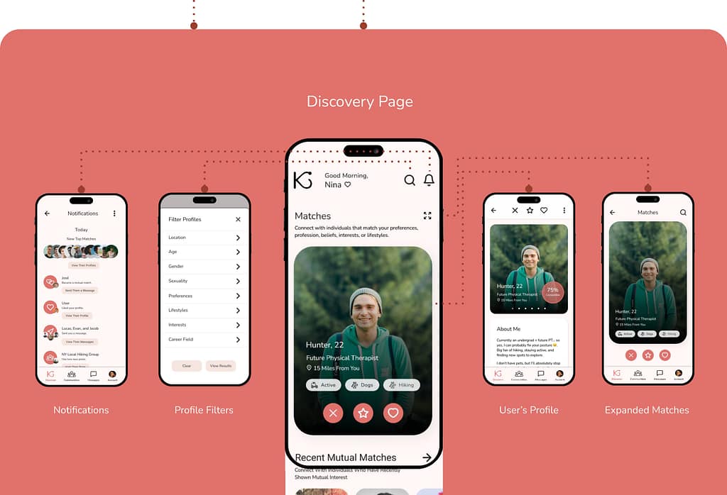
- Expand Matches Page Needed
Round 2 Findings
Round 2 Findings
- Profile Setup Quiz Buttons are not Single-Choice
- Account Page Nav Links Missing and Keyboards are Erroneously Linked
- Mutual Match Alert Repeatedly Pops Up After First Seen
- Vague Smoking/Drinking/Usage Labels
The third and fourth usability studies were moderated. They were conducted on the high-fidelity prototypes of the original user flow and the paid user flow, and each had one participant.
Round 3 Findings
Round 3 Findings
- Create Date Feature is in an Obscure Location
- Unclear Transition Between Profile Setup Questions
- Fill-In-The-Blank Answer Option Missing in the Profile Setup Questionnaire
- Q&A / Prompt Section in Profiles is Desired
- Mutual Match Profiles Lacking Descriptive Labeling
- Compatibility Percentages Wanted on Match Cards
Round 4 Findings
Round 4 Findings
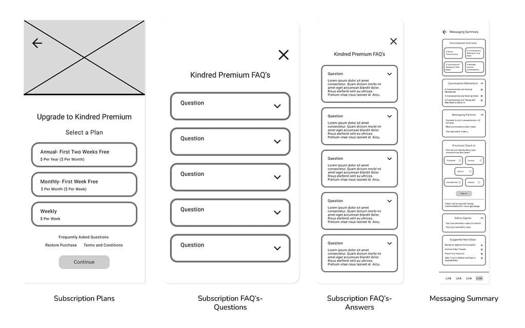
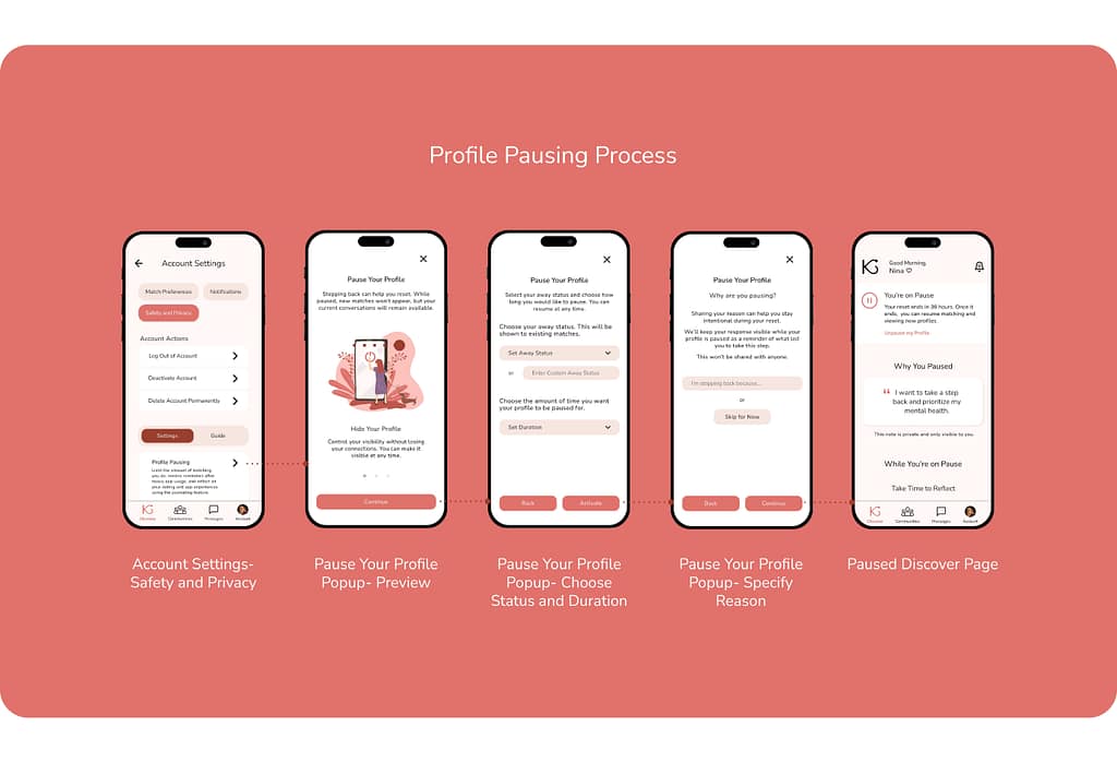
- Condense or Collapse Subscription Feature Descriptions for Easy Skimming
- Increase Spacing on the Paused Profile Discover Page for Readability
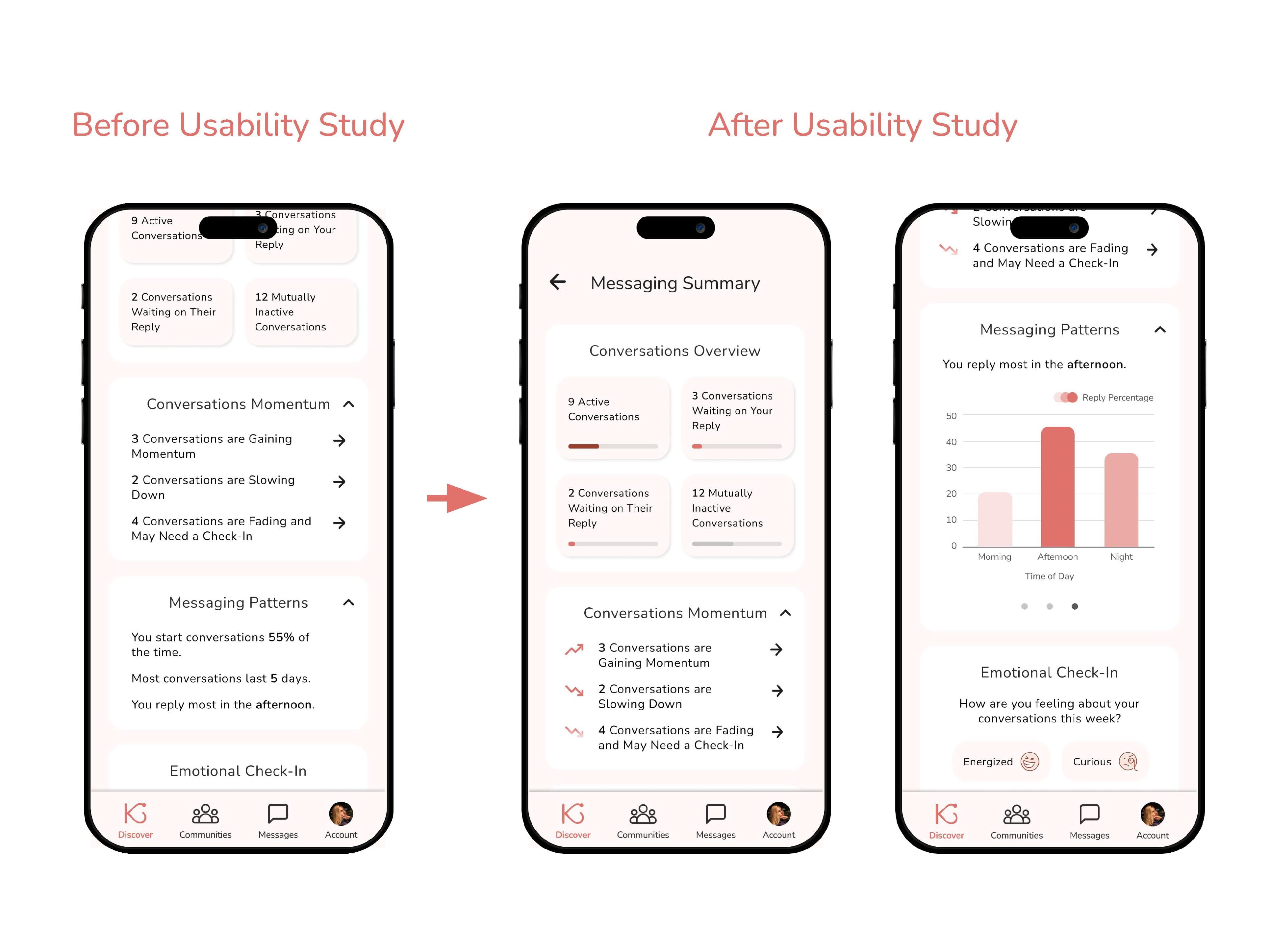
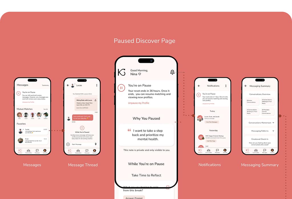
- Add Graphs to the Messaging Summary Page to Accompany the Textual Content
- Add a Descriptive Pop-Up to the Private Journaling Page for New Users
RESEARCH AND KEY INSIGHTS
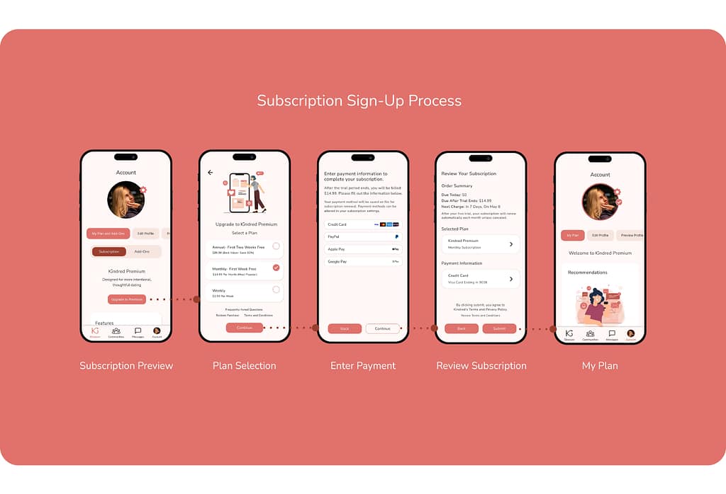
Product Survey Findings
The product survey was conducted to learn more about dating app users’ opinions on premium subscriptions and gauge their interest in the proposed subscription service for Kindred. Nine individuals participated.
4/8 participants rated their satisfaction with dating apps as being neutral.
Participants were most frustrated by stagnant conversations, safety concerns, poor profile visibility, ghosting, low-quality matches, and superficial swiping.
4/8 participants avoid paid subscriptions.
This suggests a barrier to converting users to paid customers. Regardless of their disinterest in subscriptions, most participants were receptive to Kindred’s proposed subscription tier.
RESEARCH AND KEY INSIGHTS
Second Unmoderated Usability Study Findings
A second unmoderated usability study was conducted on Maze to test how easy and intuitive it is for users to go through the process of signing up for Kindred’s premium subscription service. There were 17 participants and 3 drop-offs.
82.4% Success Rate
The average mission completion length was 9.6 steps.
17.6% Drop-Off Rate
Three participants left before completing the usability study.
53.2% Misclick Rate
Common misclicks came from clicking on unclickable areas, returning to a previous page instead of continuing the process, and clicking on other areas besides the upgrade button.
DESIGN ITERATIONS
Primary User Flow
Pain Point:
“Even if it’s not a good option to skip, shouldn’t there be a skip option anyway? Especially if you can turn it back on later.”
Solution:
Added a button that gives users the option to deny location access before receiving the device’s permission popup.

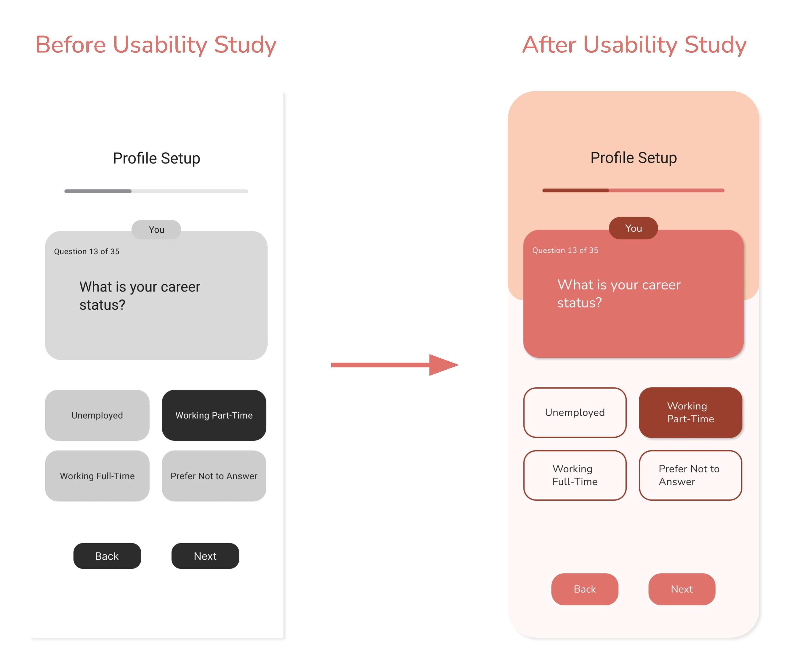
Pain Point:
“I know we’re not quite at the complete stage yet, but I think adding some differing color to specify ‘you’ vs ‘your future partner’ will help confusion. 1 almost missed the difference at the top because it’s so small, so maybe making the text a little bigger might help too.”
Solution:
Enlarged the text sizes used throughout the profile setup quiz and emphasize the question labels by using a darkened color.
Pain Point:
“The discover page does feel a tad overwhelming with all the recents and suggestions and I almost wish they were separated from just my possible matches/swiping and looking at profiles.”
Solution:
Added an Expanded Matches page where users can focus on swiping between matches.

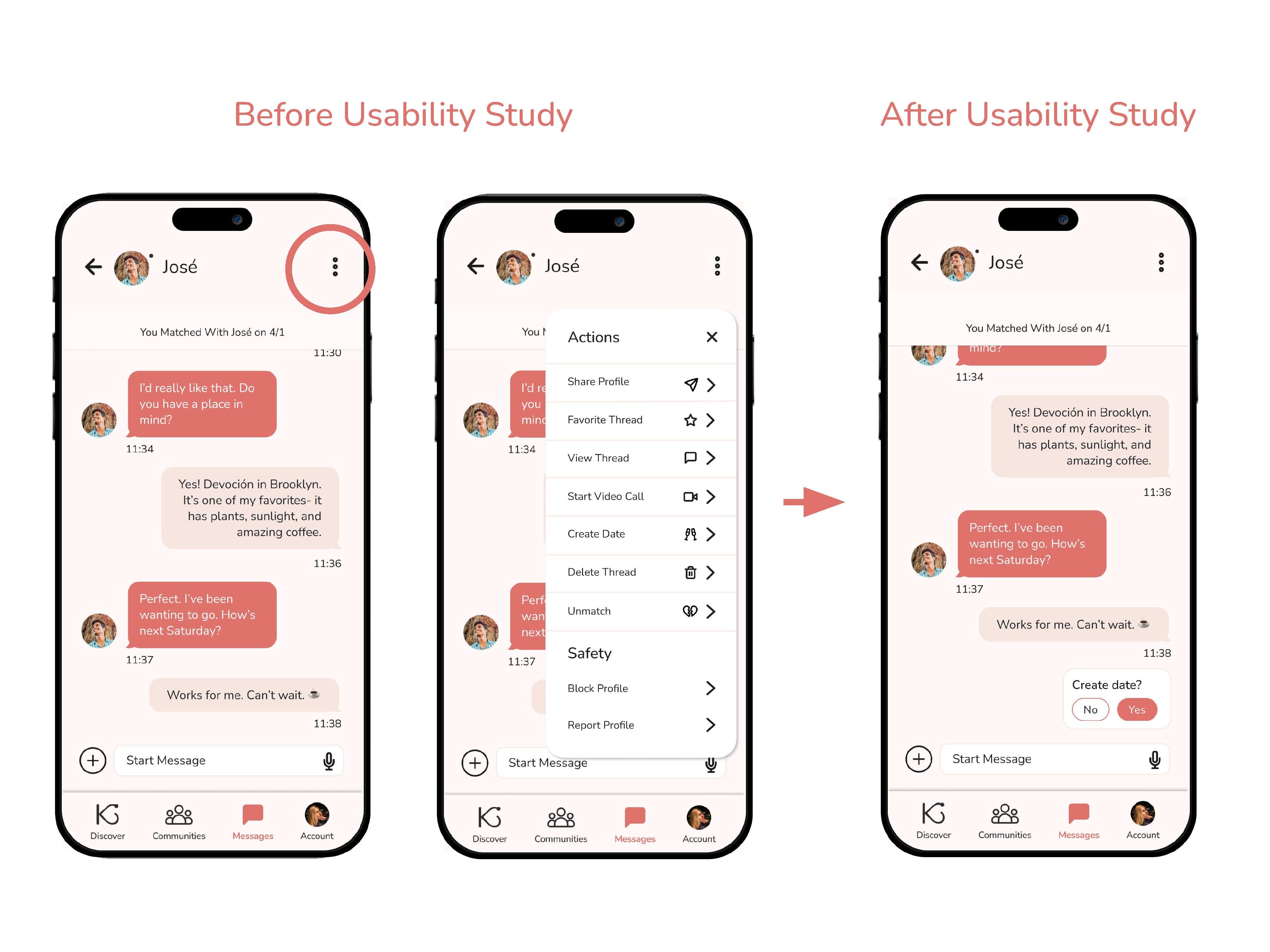
Pain Point:
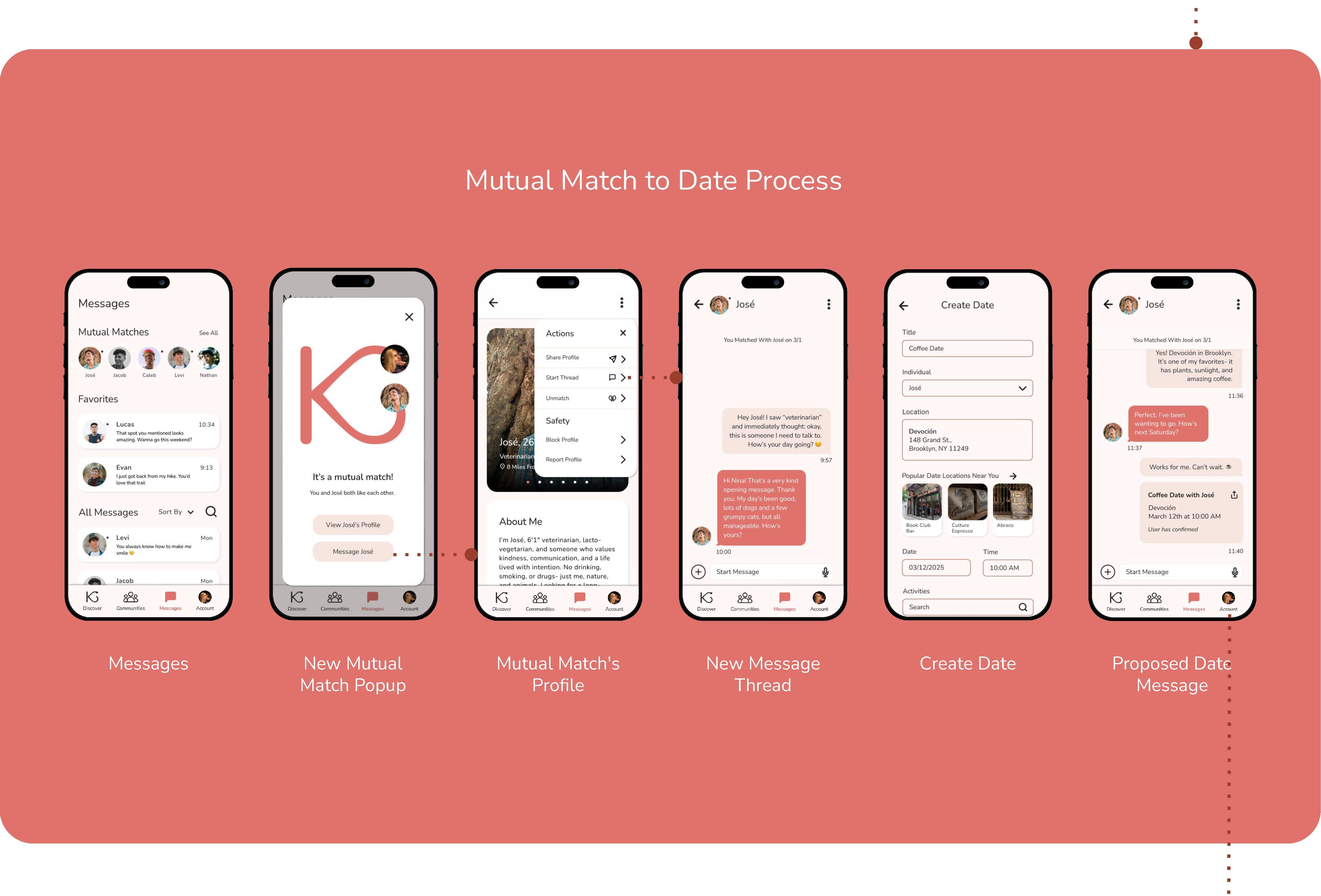
“To me, it looks like we’ve already planned the date. Is the Create Date [feature] up here? Okay. Yeah, to me that’s not very obvious. I probably wouldn’t have found that myself.”
Solution:
Implemented A Create Date message pop-up when messages are sent that suggest a date is being arranged. Users can still access the Create Date feature in the Actions menu.
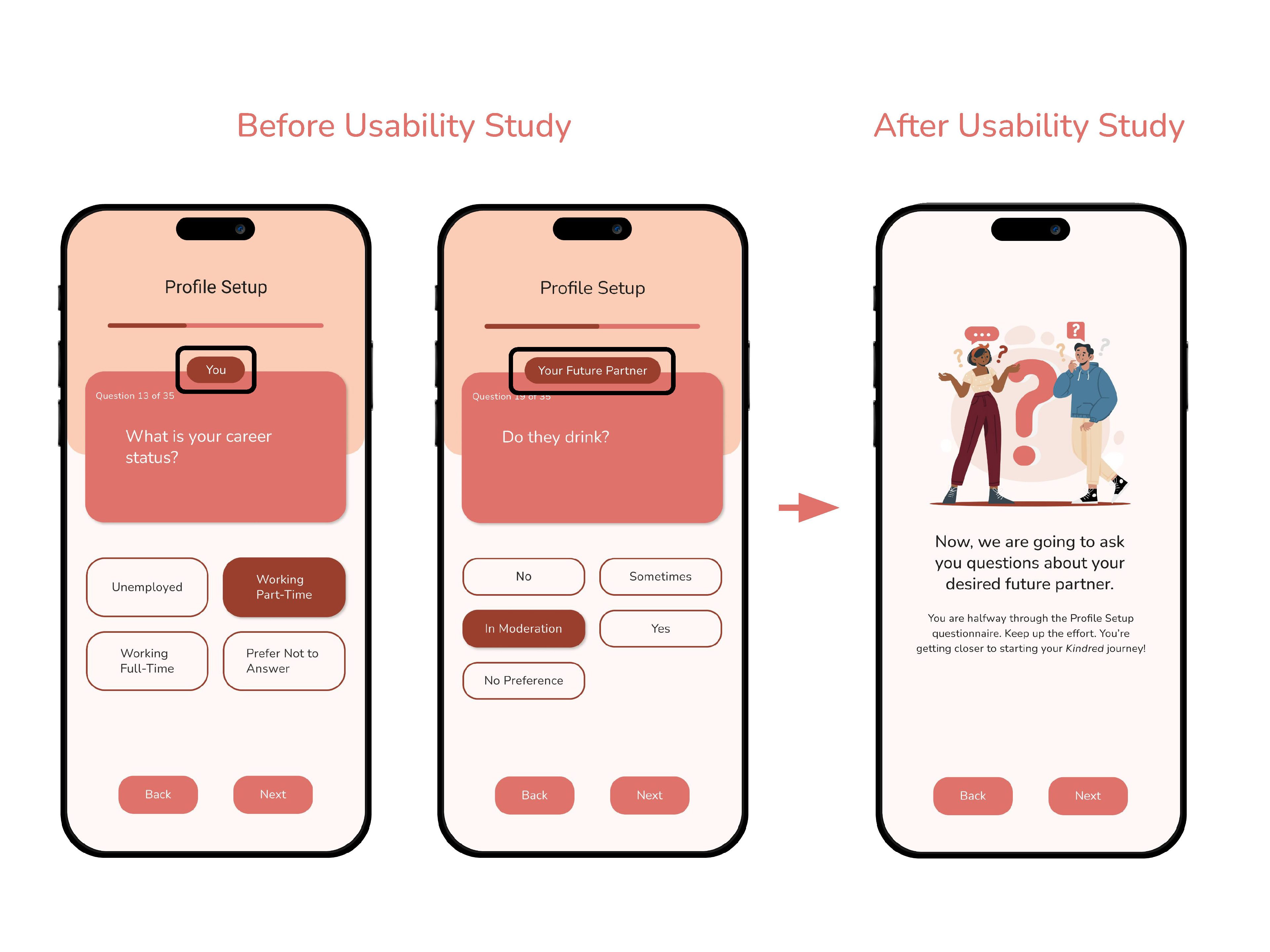
Pain Point:
“Oh, okay, your future partner… So it’s not about you on this one…. Maybe having a separation between my preferences versus what I’m looking for… ‘Cause like if I’m just skimming what I’m looking at, I could easily miss [your future partner text] or [you text] in there.”
Solution:
Added a transition page in the Profile Setup questionnaire between questions about the user and questions about the user’s desired future partner.
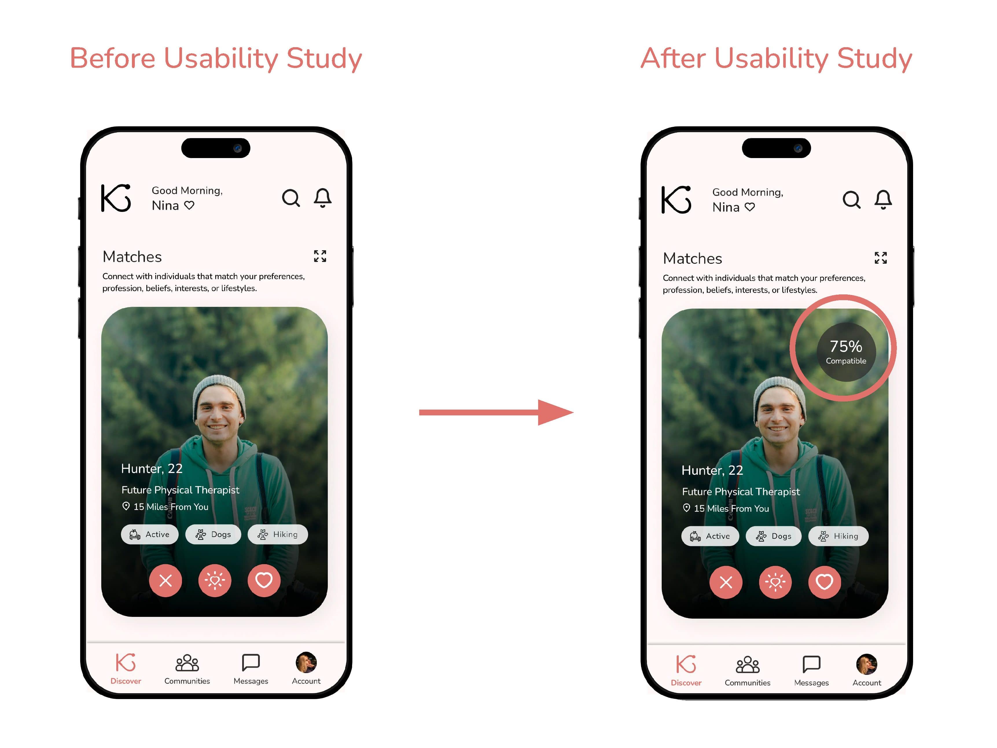
Pain Point:
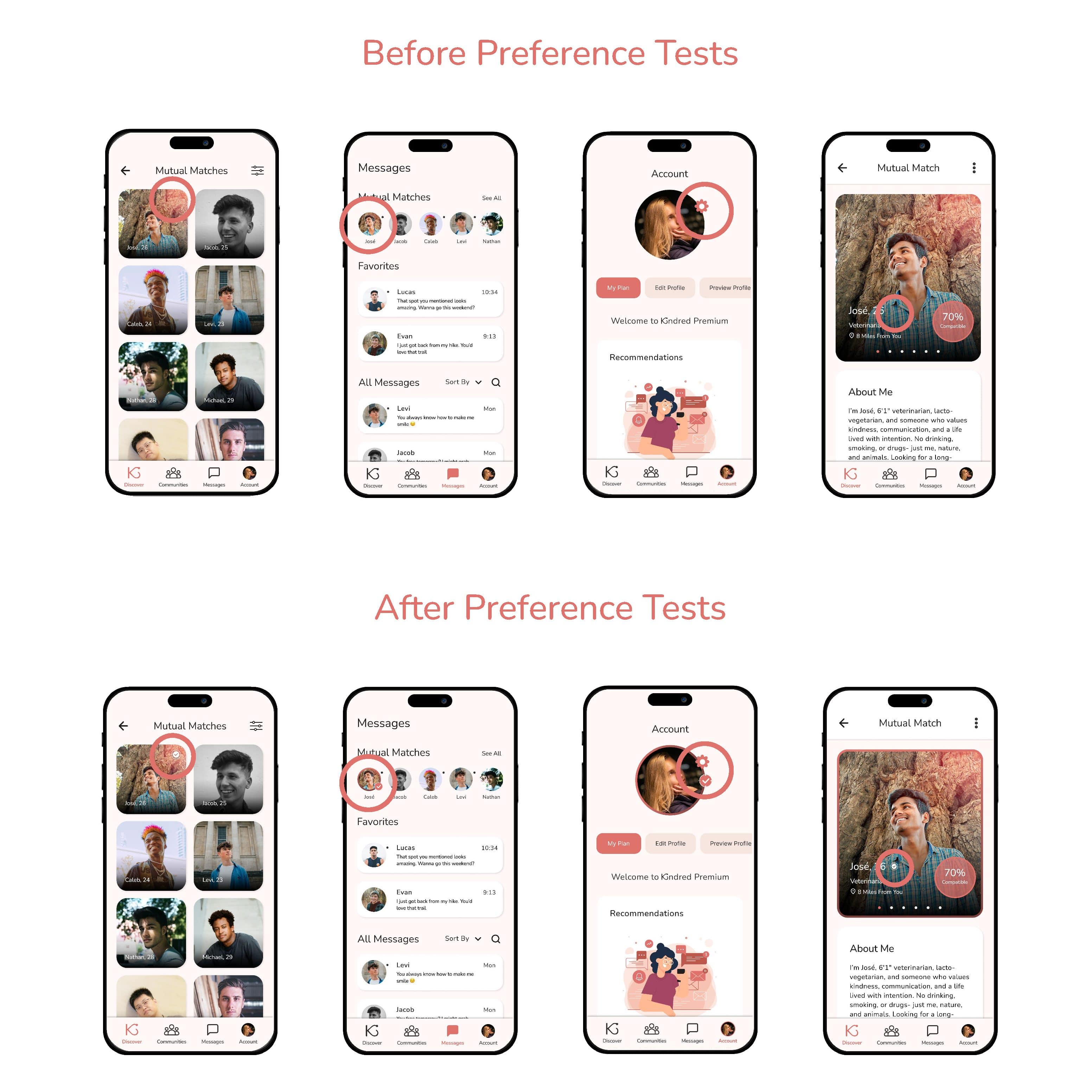
“Would like the percentage of compatibility to be on the main card, not just when you click on it, just so I could see from a glimpse how compatible I am with somebody.”
Solution:
Added Matches’ Compatibility Percentages to the interface of the match cards.
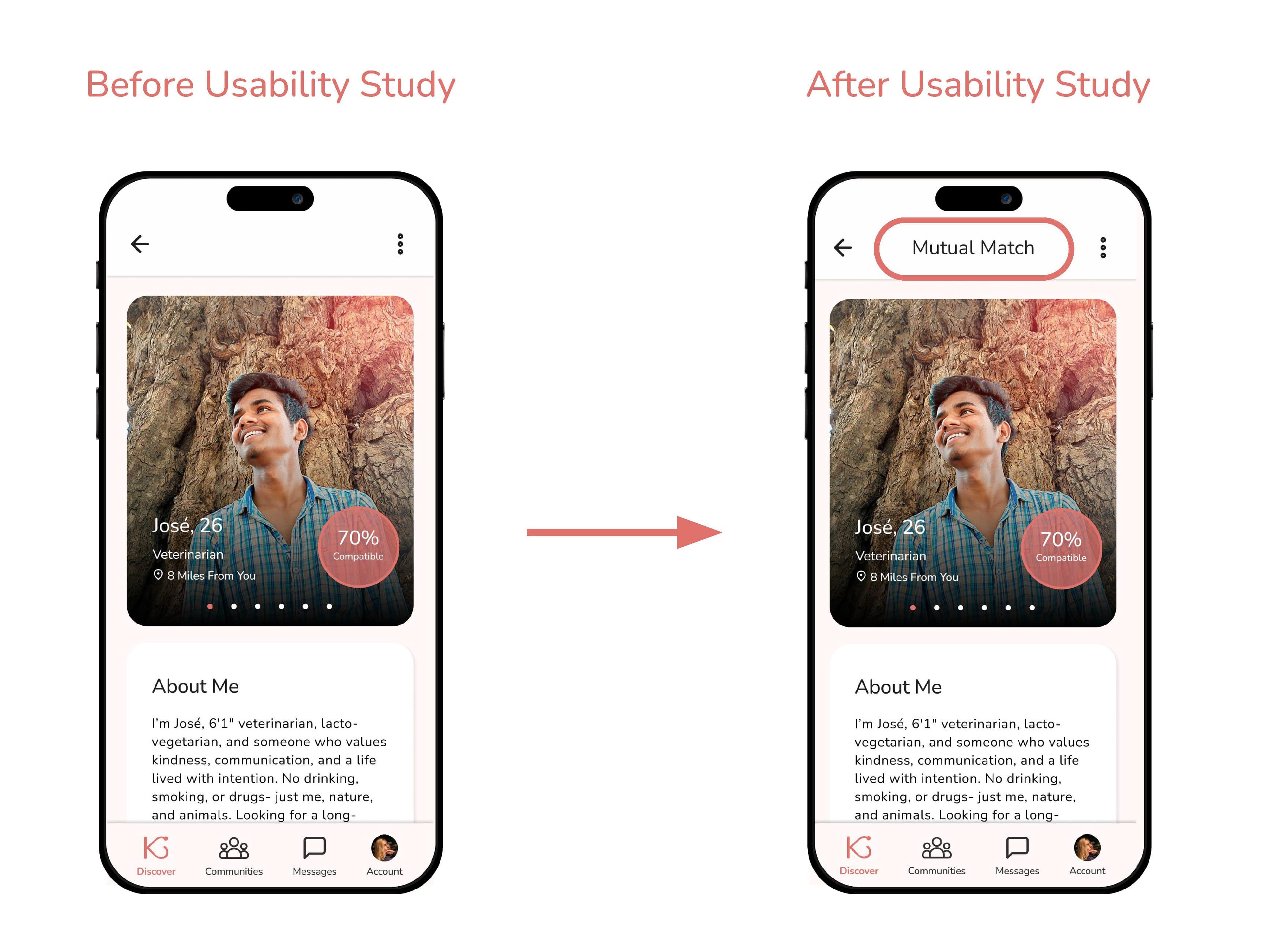
Pain Point:
“Maybe if we’re matched, I would like to see something here that says that we’re a match on their profile itself.”
Solution:
Added Mutual Match descriptor text to the profiles of users’ Mutual Matches.
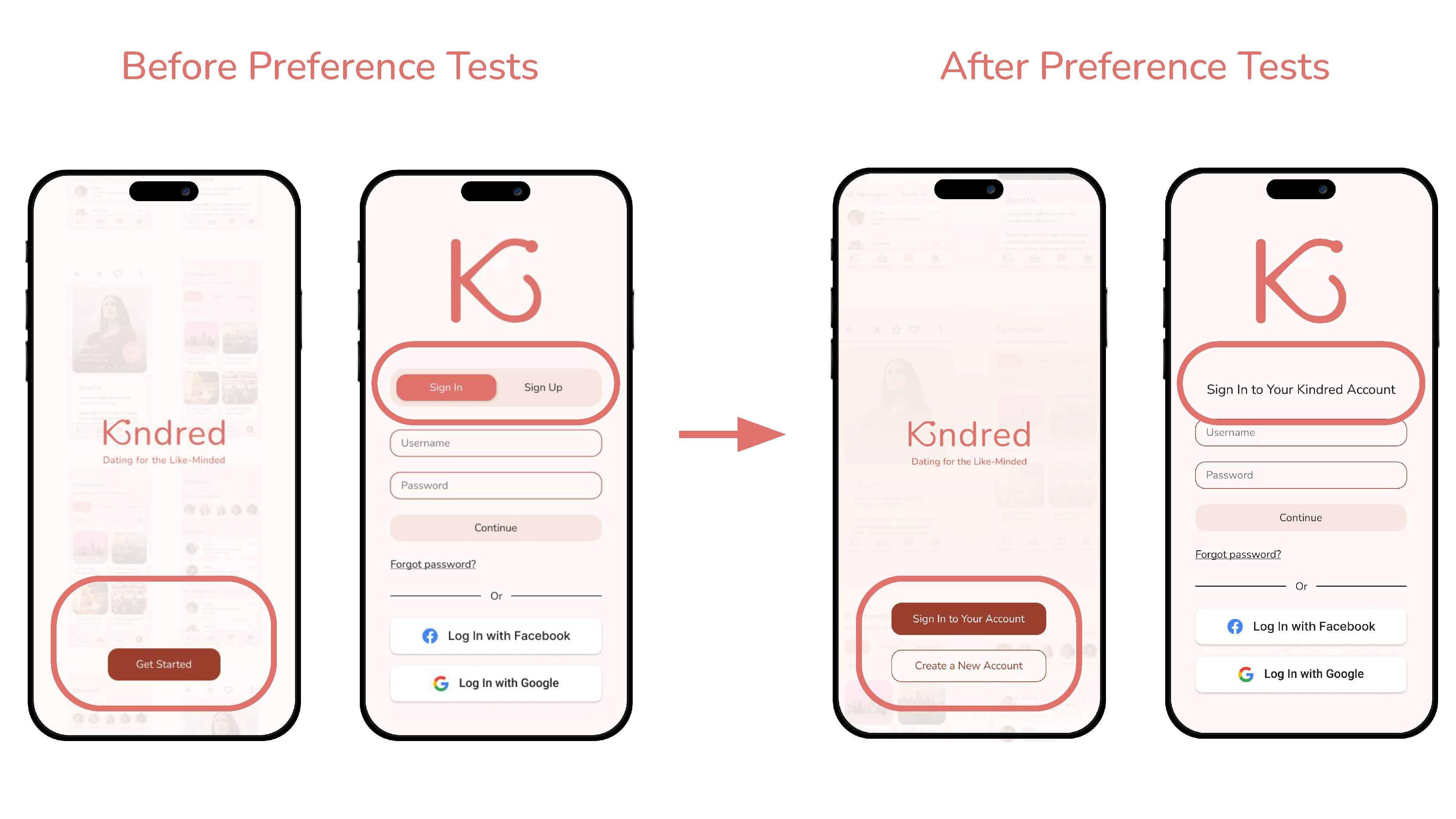
Insight:
Users preferred clearer navigation patterns. Preference testing showed 5/7 users favored redirecting radio buttons over toggle buttons and radio buttons.
Solution:
Replaced the toggle-based entry with redirecting radio buttons.
DESIGN ITERATIONS
Paid User Flow
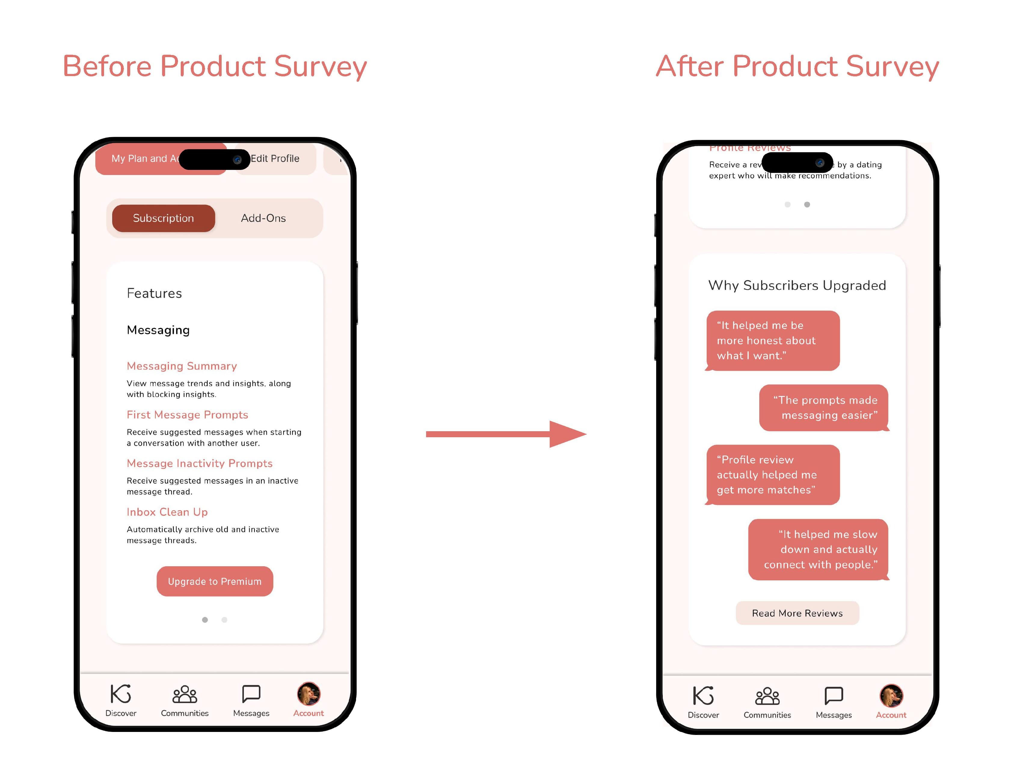
Insight:
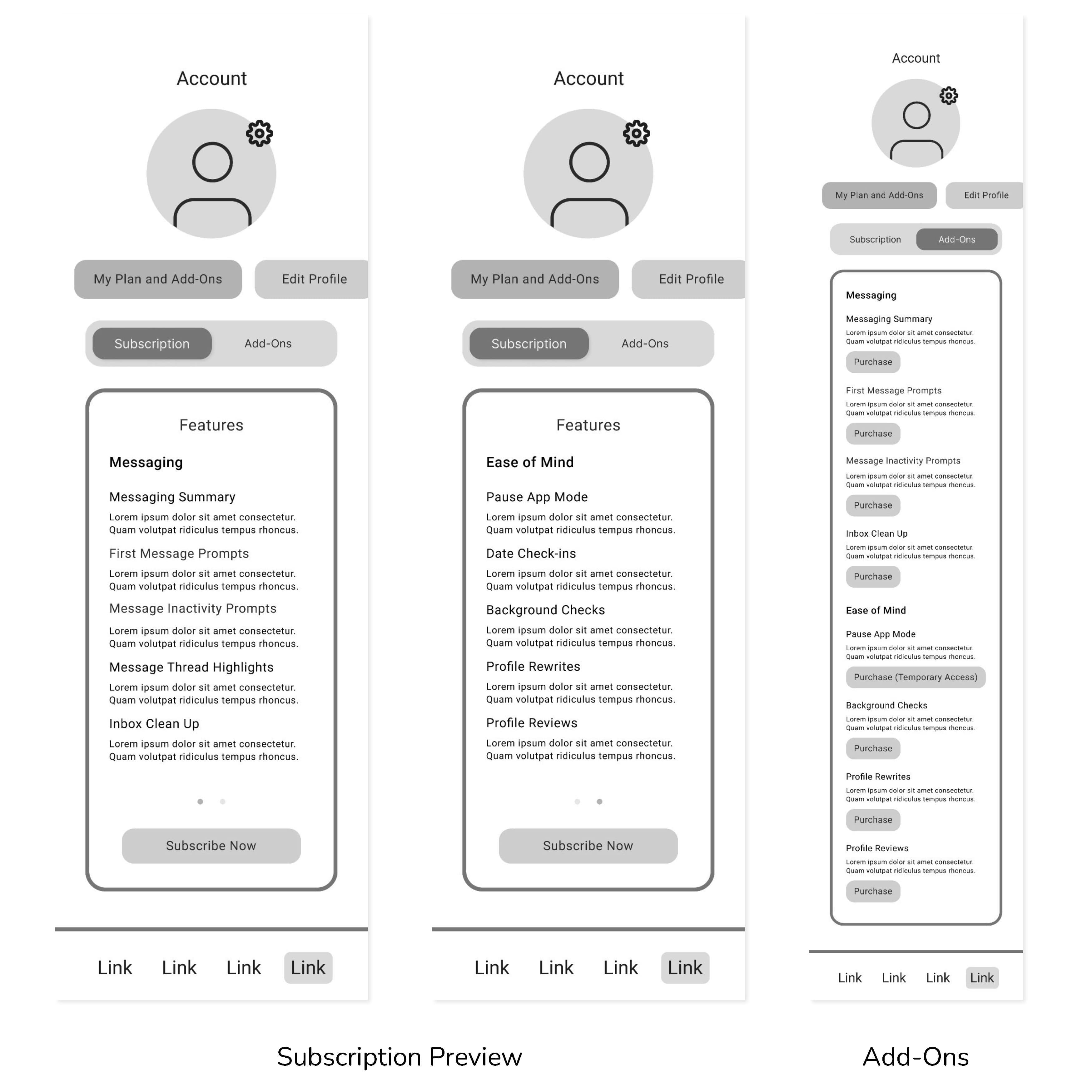
There is a barrier to converting users to paid subscribers due to a lack of perceived value.
Solution:
Added a card with subscription reviews that highlight why users subscribed and a button that links to more reviews.
Insight:
Users preferred simple, recognizable indicators. Preference tests showed strong preference for checkmark-style badges.
Solution:
Implemented the selected badge design for premium users across the prototype.
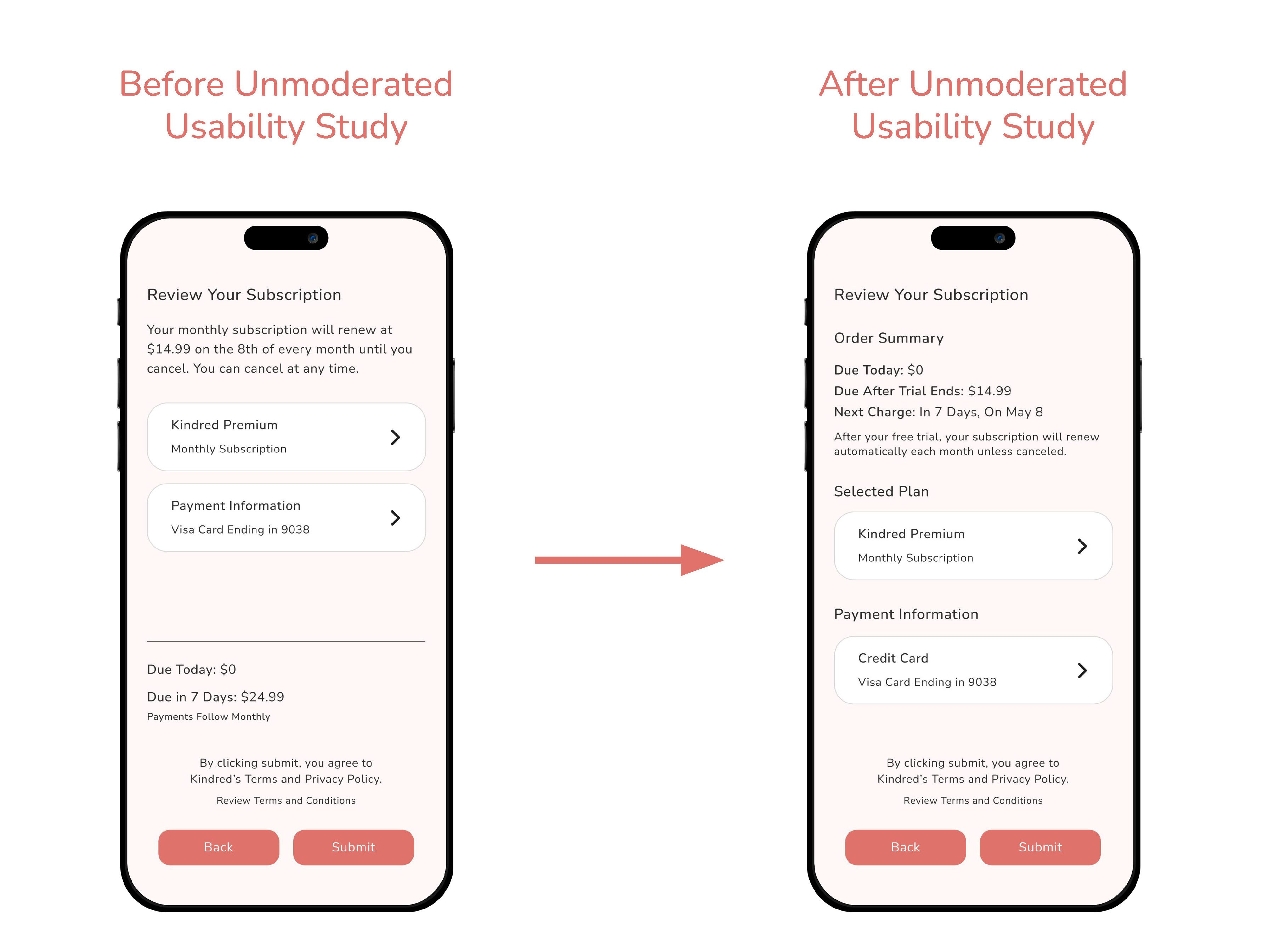
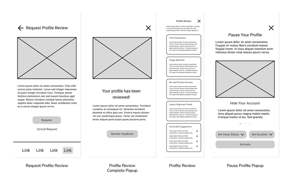
Pain Point:
“I would update the order summary section. Breaking up the information to make it scannable with key details such as the cost and duration as bolded line items would make it clearer to a customer. These details can be conveyed in a simpler format rather than reading it as a short paragraph. The last two [sentences] are a bit repetitive about cancellation.“
Solution:
Removed redundant information and restructured the hierarchy. Created a new order summary section and labeled the selected plan and payment information cards.
Pain Point:
“I saw there was a graph on the icon to get here, and now I don’t see the graph. I feel like that might need to be somewhere here.”
Solution:
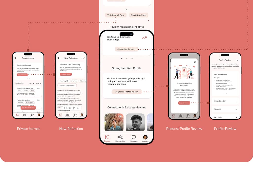
Added bar charts, a donut chart, a line graph, and illustrative Icons to the Messaging Summary page.
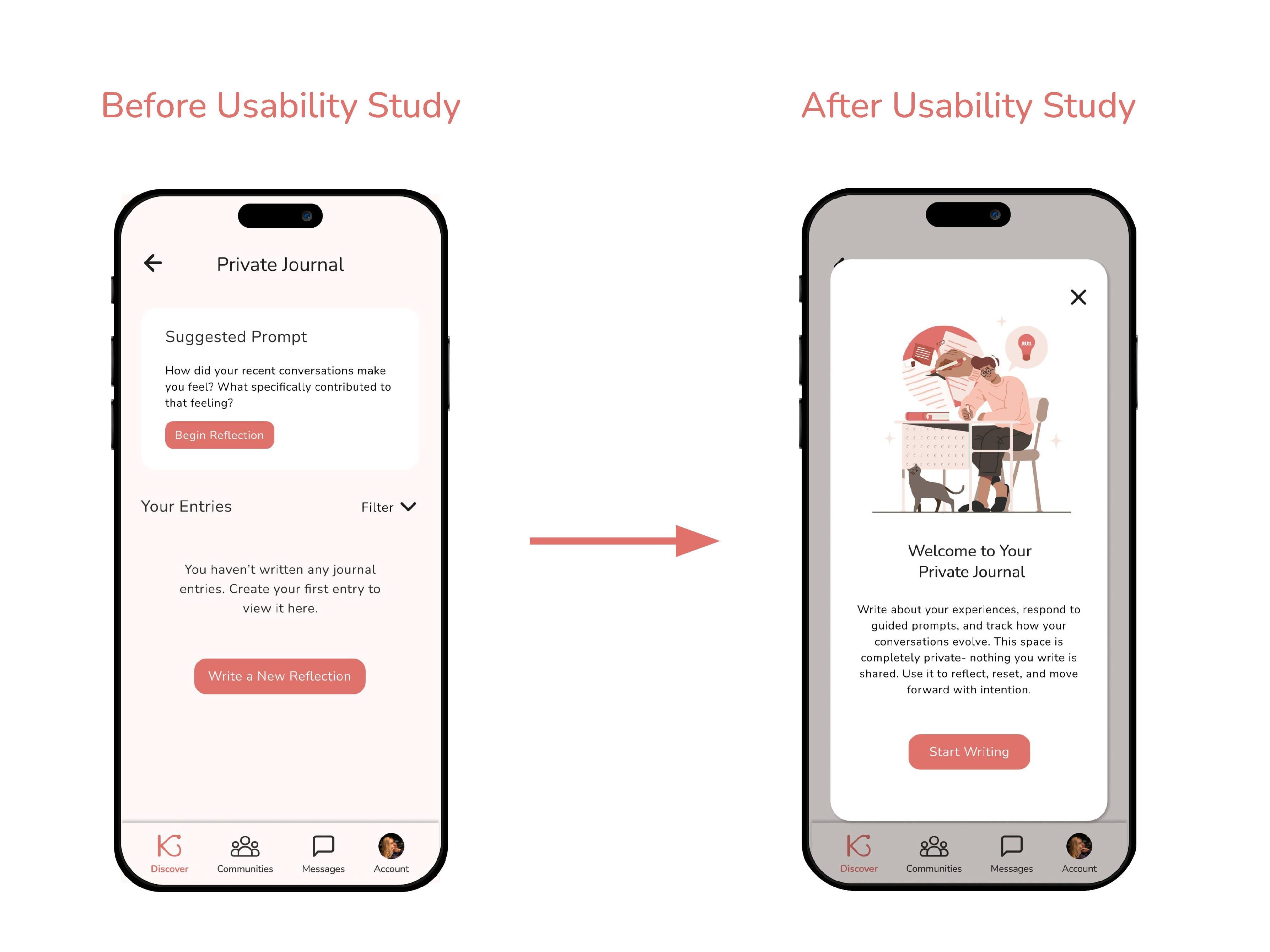
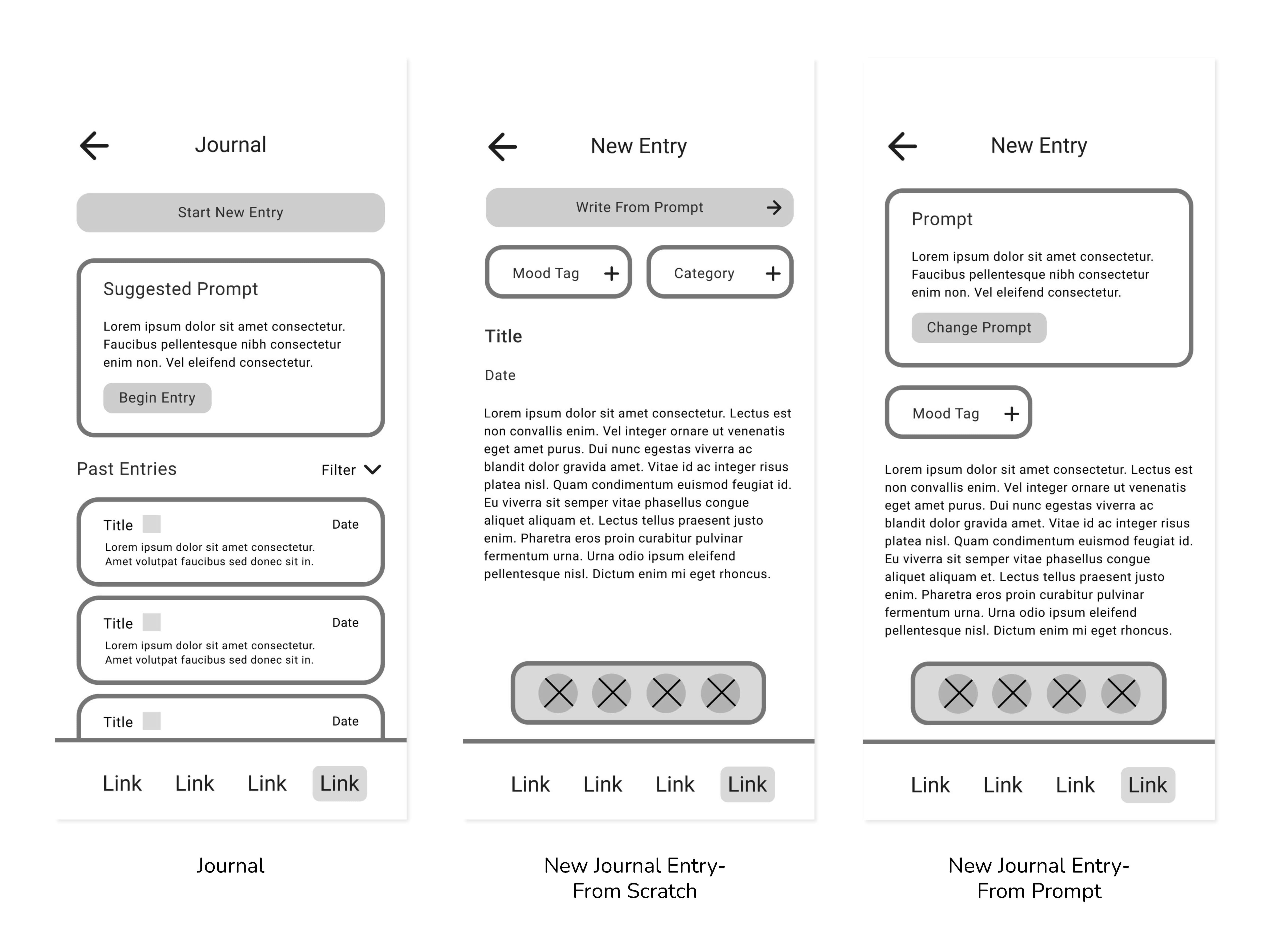
Pain Point:
“It was a little bit confusing and I’m trying to figure out why. Maybe I need like a pop-up just to explain what the feature is best used for before I dive into it would help, but the UI seems straightforward.”
Solution:
Added an explanatory pop-up to the Private Journal page that appears to new users.
DESIGN PROCESS
Drawn Wireframes
Drawing wireframes allowed for rapid iteration of the app’s layout and exploration of what pages were essential to demonstrate the user flow. Wireframes were chosen that had the most intuitive navigation and best met the user’s needs.


Chosen Wireframes- Primary User Flow
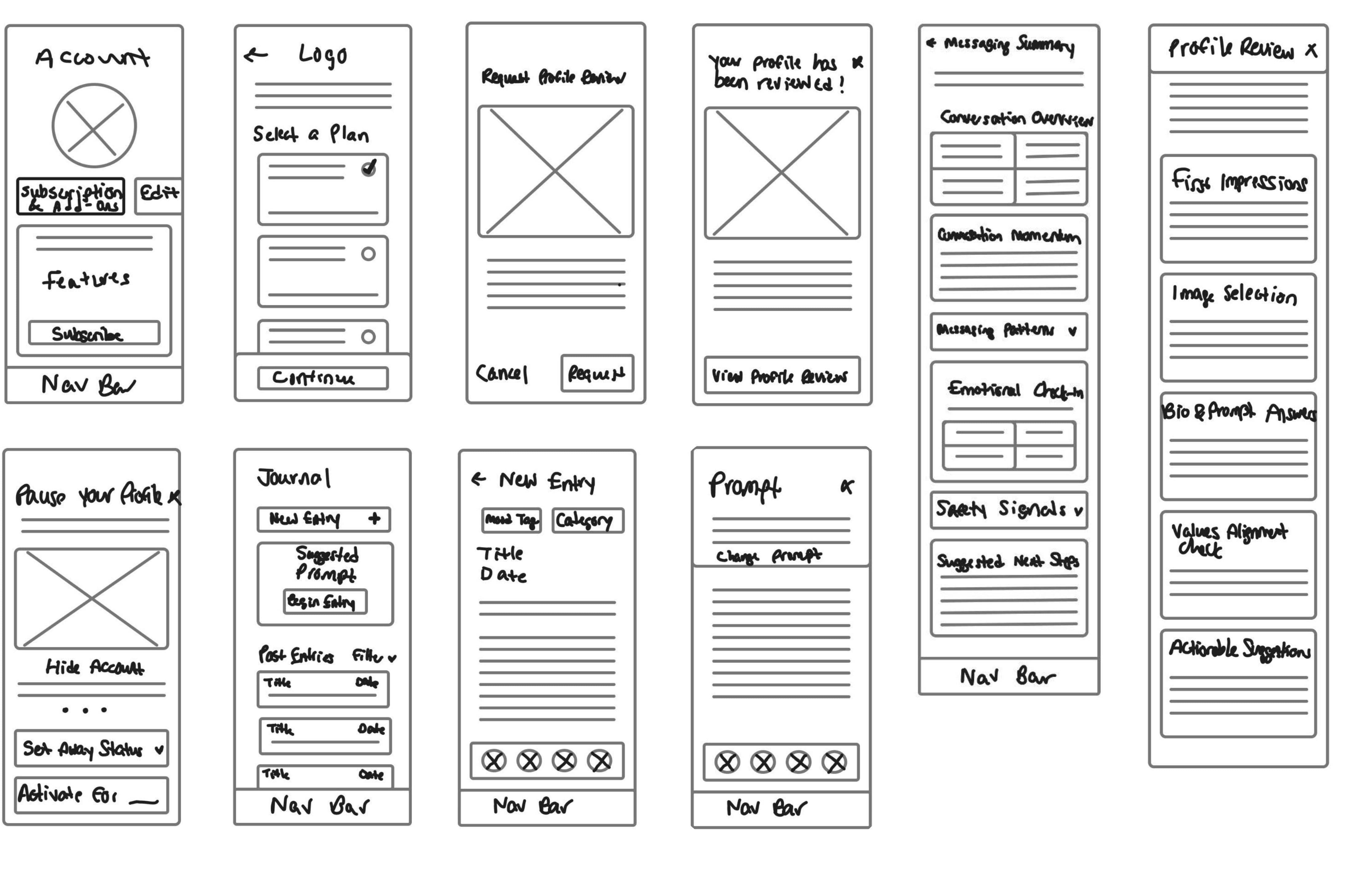
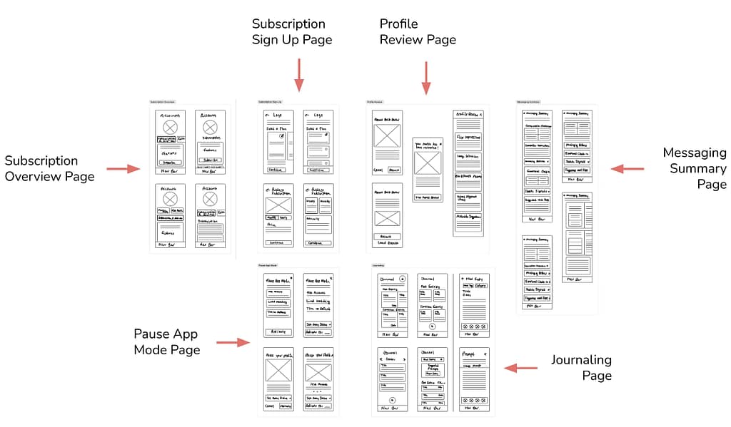
DESIGN PROCESS
Digital Wireframes
The wireframes were then transitioned in Figma to a modifiable digital format. The layout was further realized, and key elements were added, such as input fields, buttons, and labels.
Primary User Flow


Paid User Flow
DESIGN PROCESS
Low-Fidelity Prototype
The layout and user flow were finalized during the creation of the low-fidelity prototype.
Figma Prototype Link:
DESIGN PROCESS
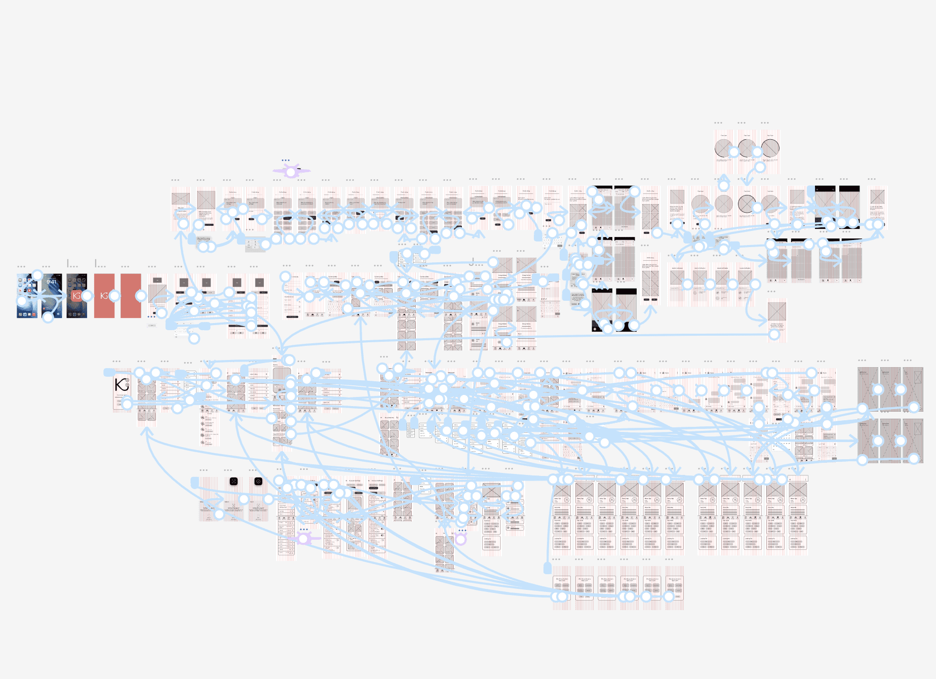
User Flow Map
Illustrates how a user would navigate through the app to achieve specific goals.

Main User Flow:
Targets intentional daters who want to utilize Kindred’s core features to connect with other users once mutual interest is confirmed.
- Open App
- Log In or Sign Up
- Browse Matches
- Receive a Mutual Match Notification
- View the Mutual Match’s Profile
- Start a New Message Thread with the Mutual Match
- Send Messages to Profile and Plan a Date
Paid User Flow:
Targets users who are interested in paying for premium features that give them additional functionality for increased safety measures, app reflection to prevent burnout, and easier conversations with other users.
- Open App
- Log In
- Visit Account Page
- Preview Kindred’s Paid Subscription Service
- Sign Up for the Service
- Turn on Pause App Mode
- View Messaging Summary
- Receive a Profile Review
- Use the Journaling Feature
DESIGN PROCESS
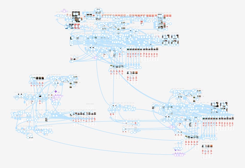
Mockups


OUTCOMES AND NEXT STEPS
Outcomes and Impact
- Improved feature discoverability by giving additional context and pop-ups
- Increased clarity in profile setup and profile matching user flows
- Reduced cognitive load with clearer hierarchy and simplified text
- Validated prototype usability with SUS scores of 70–75 (Good range)
- Identified key interaction issues (53% misclick rate) to address in future iterations
OUTCOMES AND NEXT STEPS
Next Steps
OUTCOMES AND NEXT STEPS
Takeaways
User Feedback:
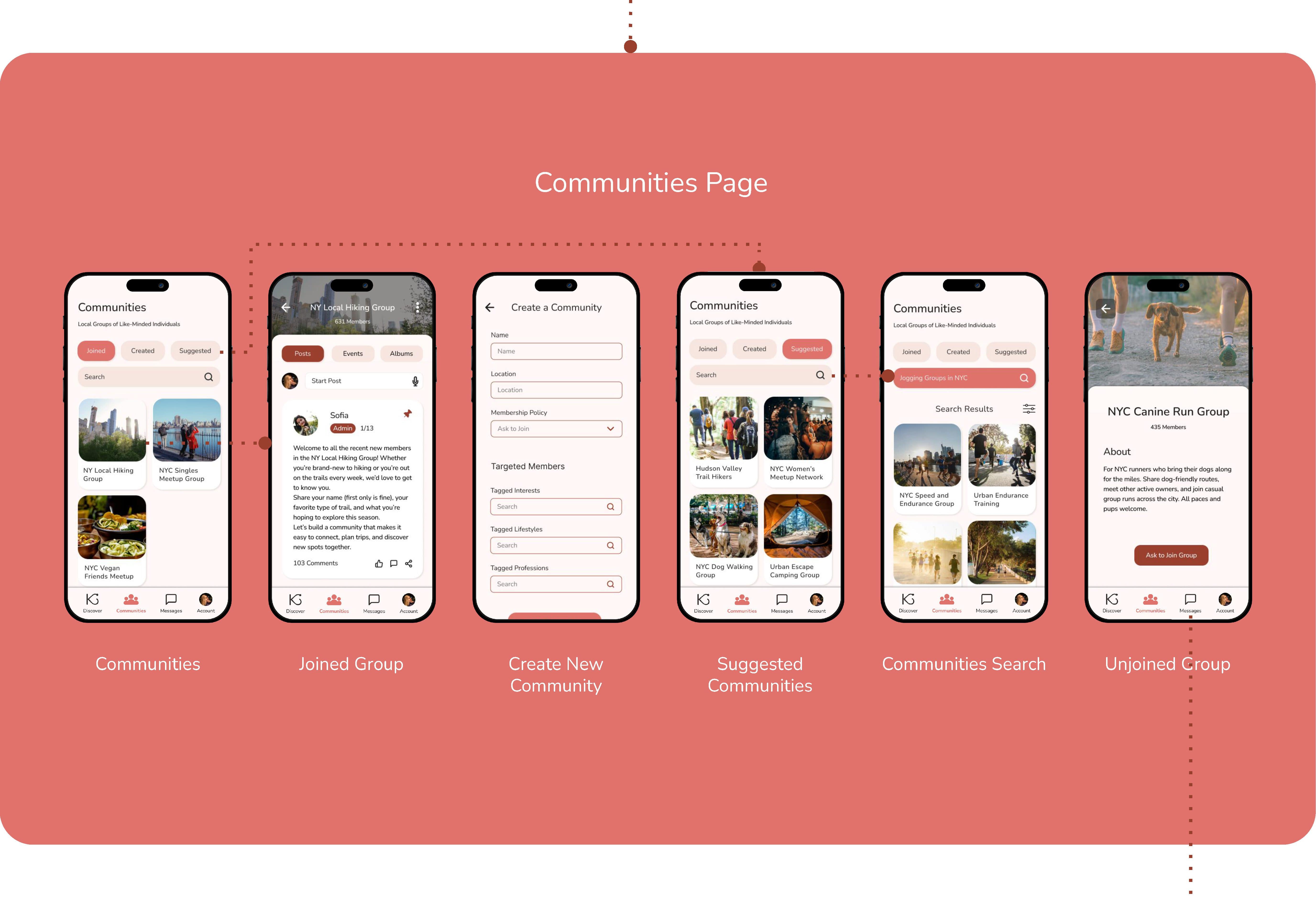
“This app is well-developed, and the community section makes it stand out from other apps. I am not a fan of dating apps, but I do like this one, especially because of this particular section.”
“I would give this app a try because the search feature is really unique and not something I have seen on any other dating apps.”
What I Learned:
This project was my introduction to the design thinking framework and using Figma to create wireframes and prototypes. It was also my introduction to running moderated and unmoderated usability studies, product surveys, and preference tests. My experience with this project emphasized the importance of research and testing and design iterations.