Kindred App Design
Kindred is a fictitious online dating app that allows its users to connect with like-minded individuals who have shared hobbies, interests, lifestyles, careers, or beliefs.
Kindred is a fictitious online dating app that allows its users to connect with like-minded individuals who have shared hobbies, interests, lifestyles, careers, or beliefs.
Its target audience is Individuals who are 18 or older, are searching for a relationship, and are interested in connecting with like-minded individuals.
Project Duration:
October-December 2025
Components:
User Interface
Table of Contents
- Discover– User Research, Competitive Analysis
- Define– Personas, Problem Statements, User Journey Maps
- Ideate– Storyboards, User Flow Map, Site Map
- Starting the Design– Drawn Wireframes, Digital Wireframes, Low-Fidelity Prototype, Usability Studies
- Refining the Design– Mockups, High-Fidelity Prototype, Accessibility
- Going Forward– Takeaways, Next Steps
DISCOVER
User Research: Summary
Kindred utilizes user-centered design, creating an an app equitable for all users that takes into account their goals and pain points. To fully understand and specify the user’s problem and needs, research was conducted and processed:
Competitive Audit– Analyzes dating app competitors to identify market gaps and users’ pain points.
Personas– Defines users’ situations and experiences with dating apps.
User Journey Map– Illustrates users’ experience using the app and what pain points may arise.
DISCOVER
User Research: Pain Points
1
Subscription Emphasis
Subscription Emphasis
Users are tired of dating app subscriptions and features being locked behind a paywall. Kindred will be completely free.
2
Dishonest Users Galore
Dishonest Users Galore
Users repeatedly report problems with dishonest users and dating scams. Kindred will focus on safety features and require identity authentication.
3
Too Many Bare Profiles
Too Many Bare Profiles
Finding deep connections can be difficult with the countless bare profiles. Kindred will require users to put more time into their profiles.
4
Poor Matching Algorithms
Poorly Working Matching Algorithms
Users are continually matched with incompatible individuals. Kindred will give users the ability to filter matches by their desired criteria.
DISCOVER
Competitive Analysis
Compares four of Kindred’s top competitors- popular existing online-dating apps that also target adults 18 and older.
DEFINE
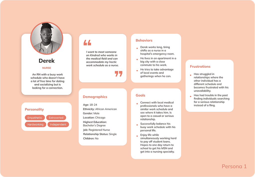
Persona: Derek
Problem Statement–
Derek is an RN with a busy work schedule who needs a dating app that can connect him with medical professionals because of his past challenges with partners not understanding his limited availability.
DEFINE
User Journey Map: Chloe
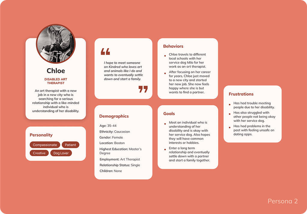
Problem Statement–
Chloe is a disabled art therapist who needs a dating app that can connect her with a like-minded individual understanding of her disability because of her past challenges with incompatible individuals.
DEFINE
User Journey Map: Derek
Follows Derek’s experience using Kindred, from downloading the app to connecting with a match and arranging to meet in person.
Opportunities to Improve User Experience:
- Promote Kindred through success stories via ads and blog posts.
- Have the option to create an account by linking accounts on other platforms.
- Offer a feedback system for rejections or add encouraging popup messages.
- Have a video chat feature.

DEFINE
Persona: Chloe
Follows Chloe’s experience using Kindred, from downloading the app to connecting with a match and arranging to meet at a coffee shop.
Opportunities to Improve User Experience:
- Use promotions to spread word about app’s features and policies.
- Make a reward system for profile progress.
- Add the ability to filter profiles by those looking for a casual or serious relationship.
- Analyze messages for inappropriate language and imagery.
- Flag and block accounts created on devices linked to other accounts.

IDEATE
Storyboards
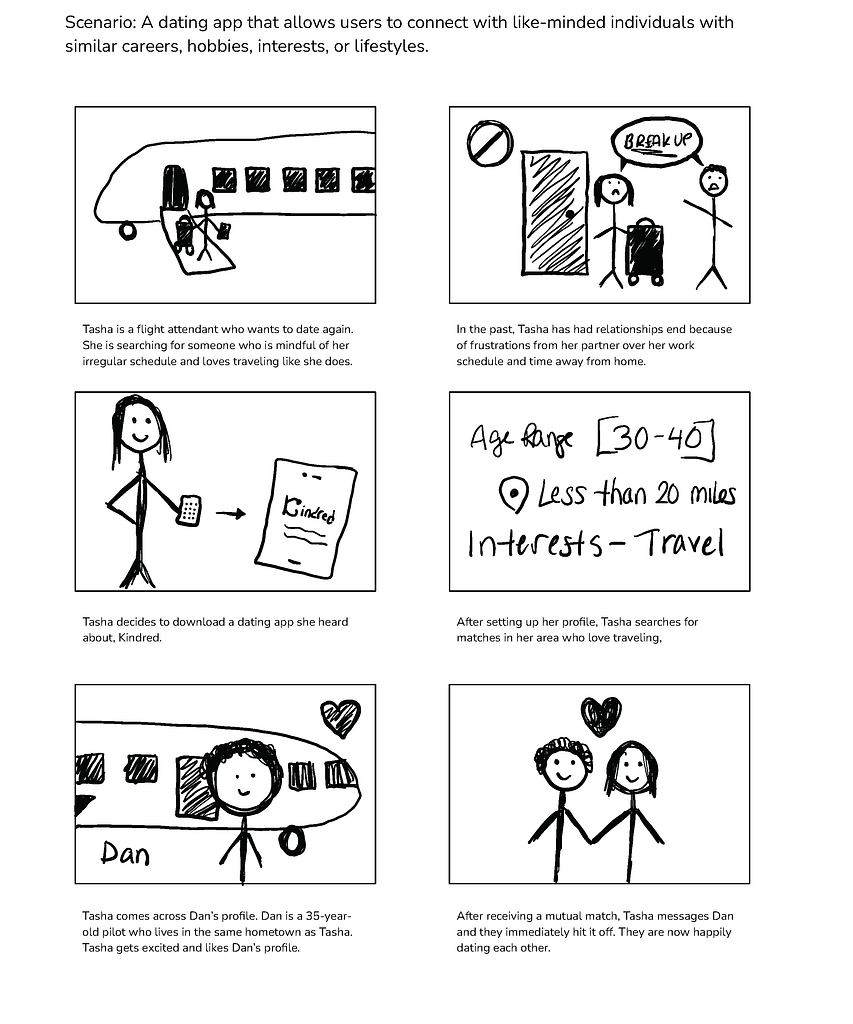
Focuses on flight attendant Tasha’s successful experience with Kindred, which matched her with flight attendant Dan based on her set preferences.
Follows a user’s experience interacting with the Kindred app, from creating their profile to swiping and searching for profiles and receiving a mutual match.
IDEATE
User Flow Map
Illustrates how a user would navigate through the app to achieve specific goals.
User Flow:
- Open App
- Login or Sign Up
- Visit Discovery Page
- Visit Account Page
- View Messages
- View Matches
- Search for Profiles
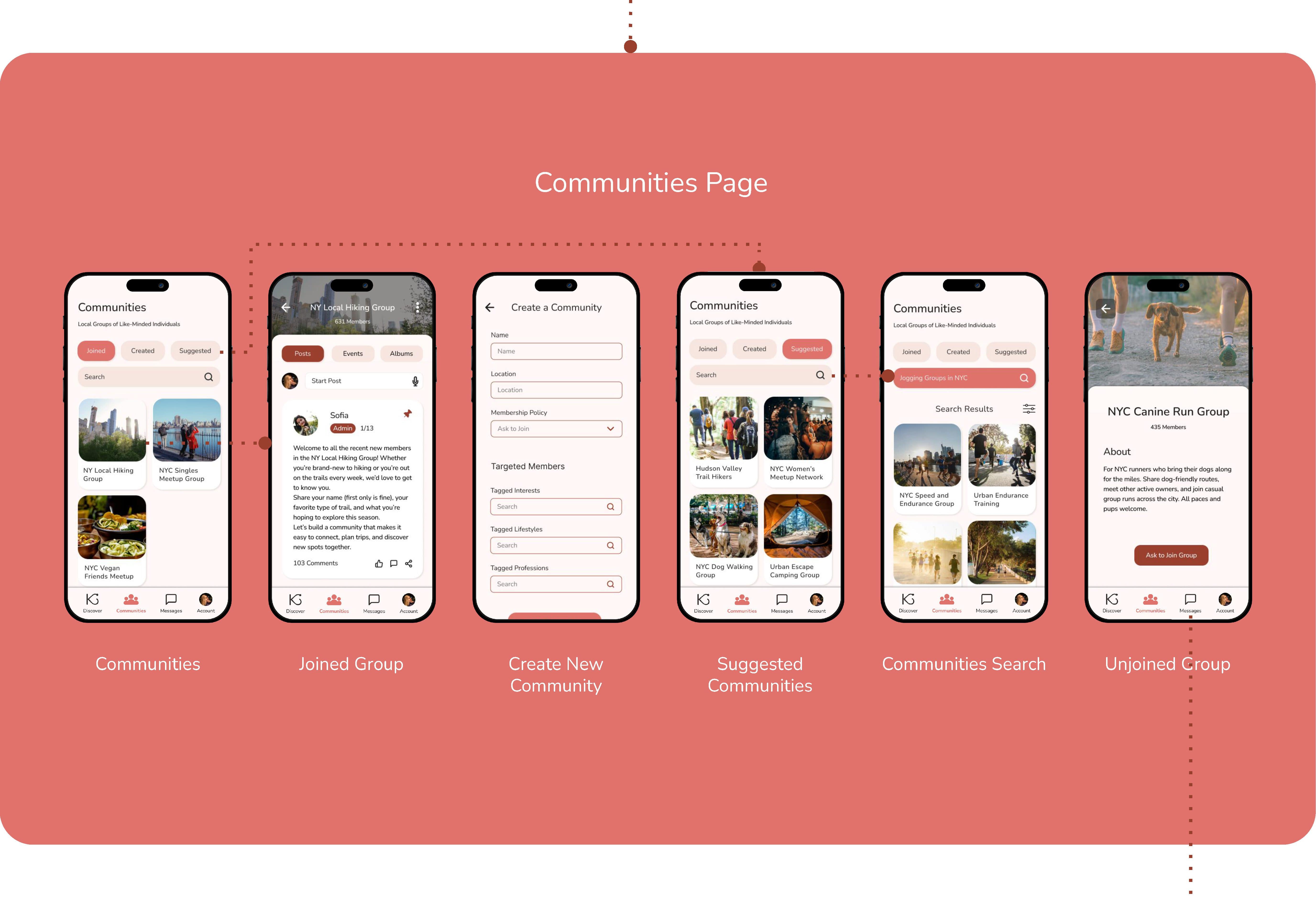
- Visit Communities Page
IDEATE
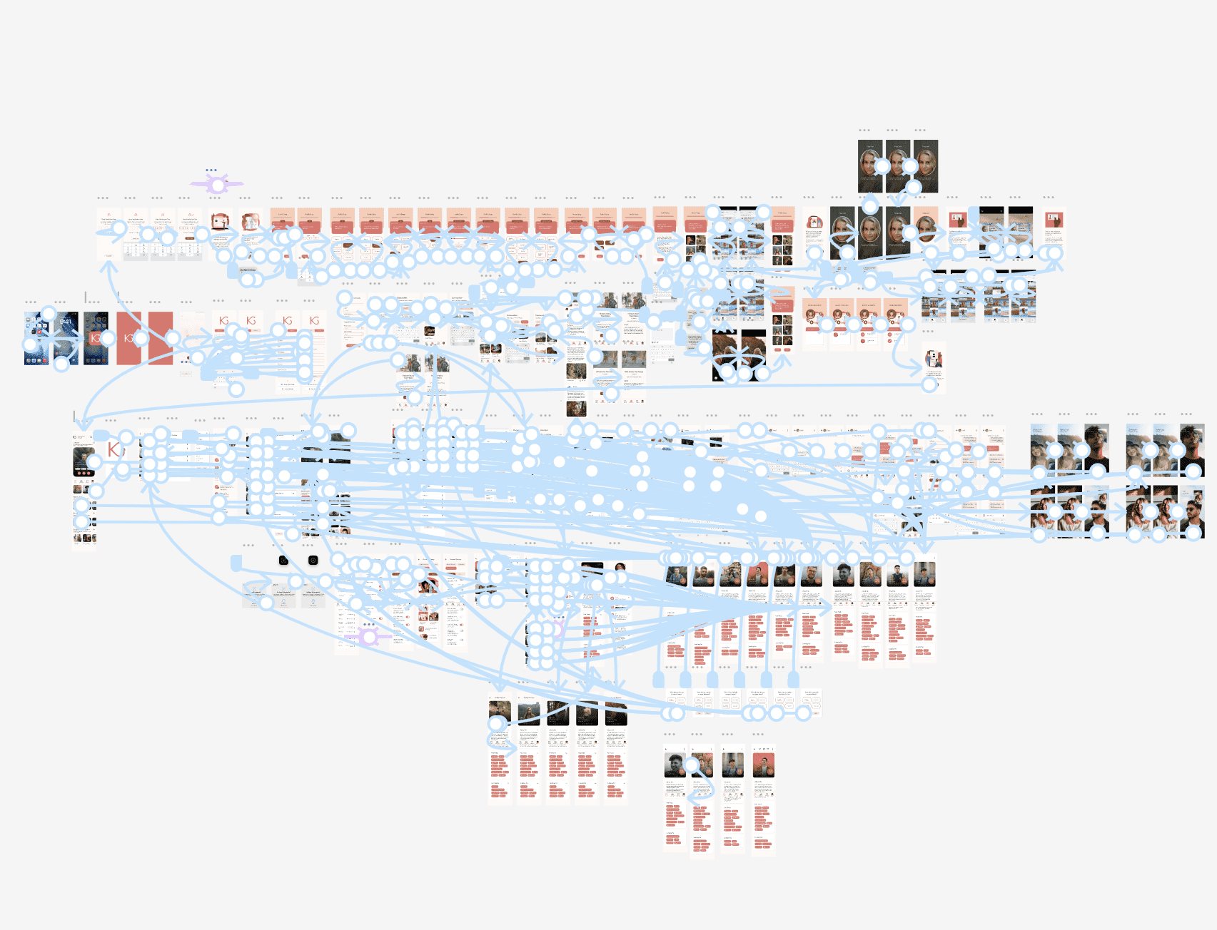
Site Map
Outlines the Hierarchy of the Mobile App
STARTING THE DESIGN
Drawn Wireframes

Drawing wireframes allowed for rapid iteration of the app’s layout and exploration of what pages were essential to demonstrate the user flow. Wireframes were chosen that had the most intuitive navigation and best met the user’s needs.

Chosen Drawn Wireframes
STARTING THE DESIGN
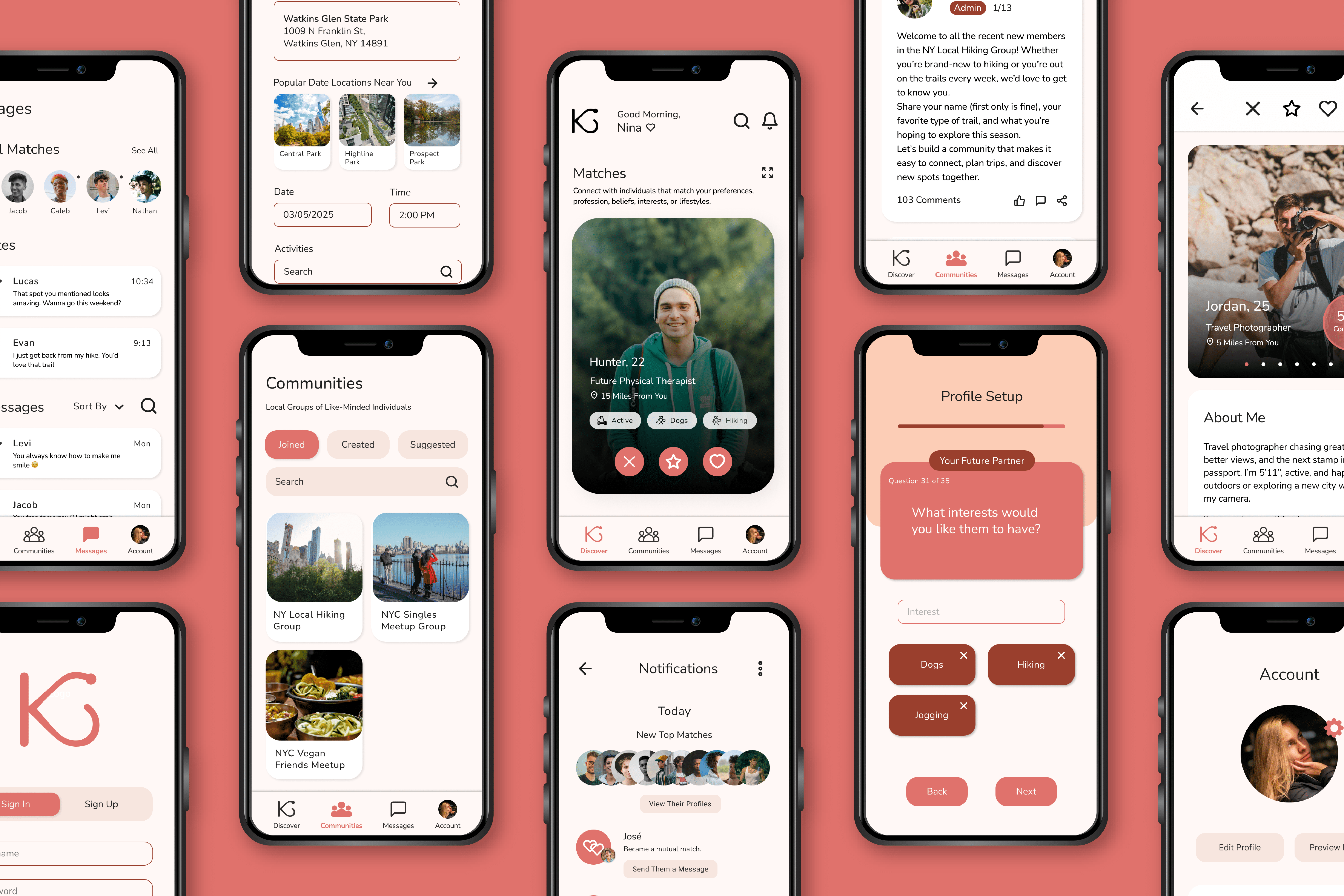
Digital Wireframes
The wireframes were then transitioned in Figma to a modifiable digital format. The layout was further realized, and key elements were added, such as input fields, buttons, and labels.


STARTING THE DESIGN
Low-Fidelity Prototype
The layout and user flow were finalized during the creation of the low-fidelity prototype.
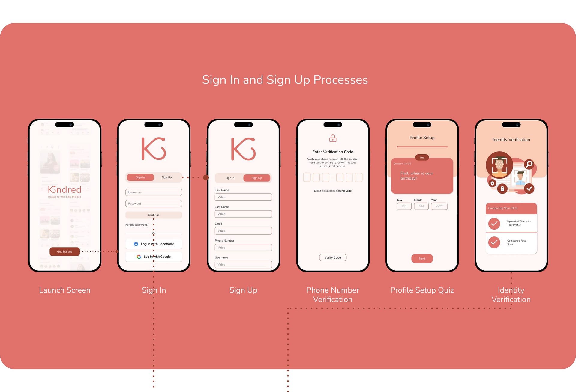
Main User Flow:
- Sign Up for an Account and Create a Profile
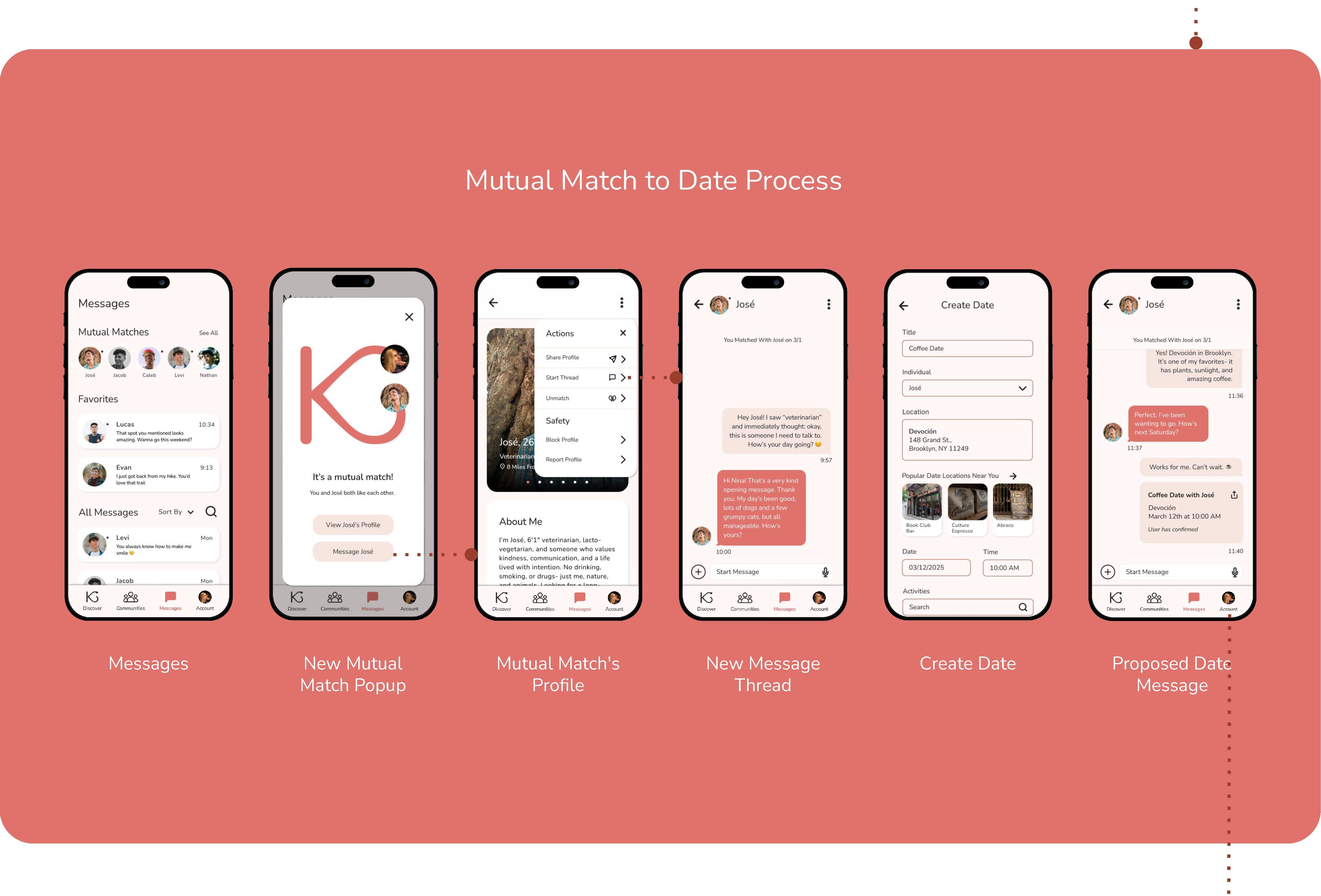
- Browse Matches and Wait for a Mutual Match to Popup
- View the Mutual Match’s Profile and Start a Message Thread
- Send Messages to Them and Plan a Date
Figma Prototype Link:
STARTING THE DESIGN
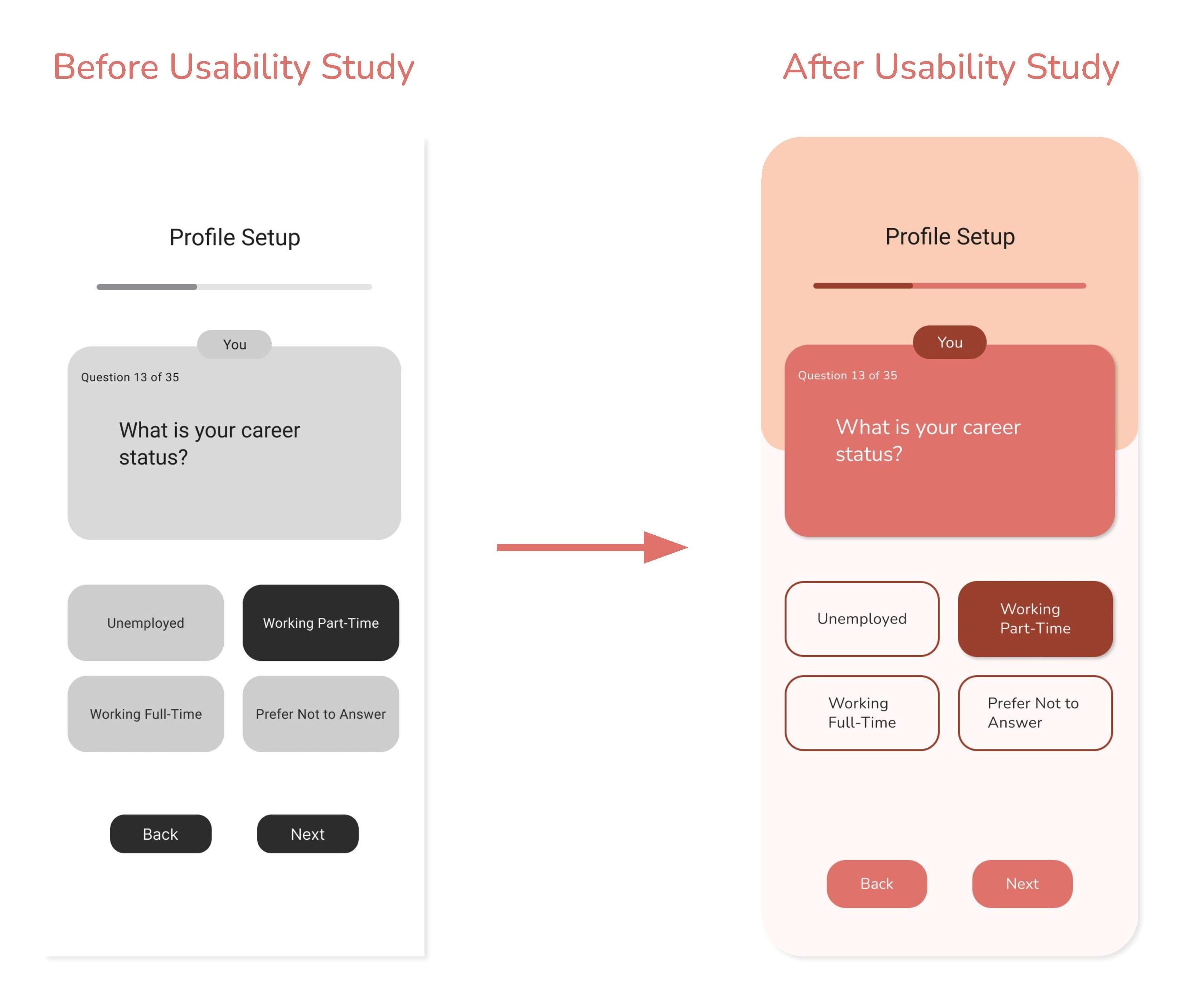
Usability Study Findings
The first usability study was conducted on the low-fidelity prototype and had six participants. The second usability study was conducted on the high-fidelity prototype and had eight participants.
Round 1 Findings
Round 1 Findings
- No Deny Location Access Option
- Small Text on Profile Setup Quiz
- Expand Matches Page Needed
Round 2 Findings
Round 2 Findings
- Profile Setup Quiz Buttons are not Single-Choice
- Account Page Nav Links Missing and Keyboards are Erroneously Linked
- Mutual Match Alert Repeatedly Pops Up After First Seen
- Vague Smoking/Drinking/Usage Labels
REFINING THE DESIGN
Mockups
Pain Point:
“Even if it’s not a good option to skip, shouldn’t there be a skip option anyway? Especially if you can turn it back on later.”
Solution:
Add a button that gives users the option to deny location access before receiving the device’s permission popup.

Pain Point:
“I know we’re not quite at the complete stage yet, but I think adding some differing color to specify ‘you’ vs ‘your future partner’ will help confusion. 1 almost missed the difference at the top because it’s so small, so maybe making the text a little bigger might help too.”
Solution:
Enlarge the text sizes used throughout the profile setup quiz and emphasize the question labels by using a darkened color.
Pain Point:
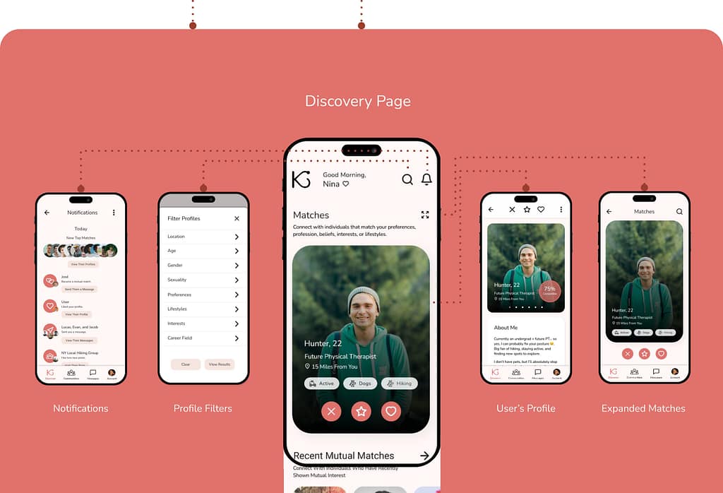
“The discover page does feel a tad overwhelming with all the recents and suggestions and I almost wish they were separated from just my possible matches/swiping and looking at profiles.”
Solution:
Add an Expanded Matches page where users can focus on swiping between matches.


REFINING THE DESIGN
Accessibility Considerations
Color and Text Size
Color and Text Size
Color choices and font choices were made while being cognizant of users with limited vision.
Familiar Icons and Symbols
Familiar Icons and Symbols
For neurodiverse users, navigation was kept consistent, and easily decipherable icons were used, such as arrows, stars, or hearts.
Messaging Features
Messaging Features
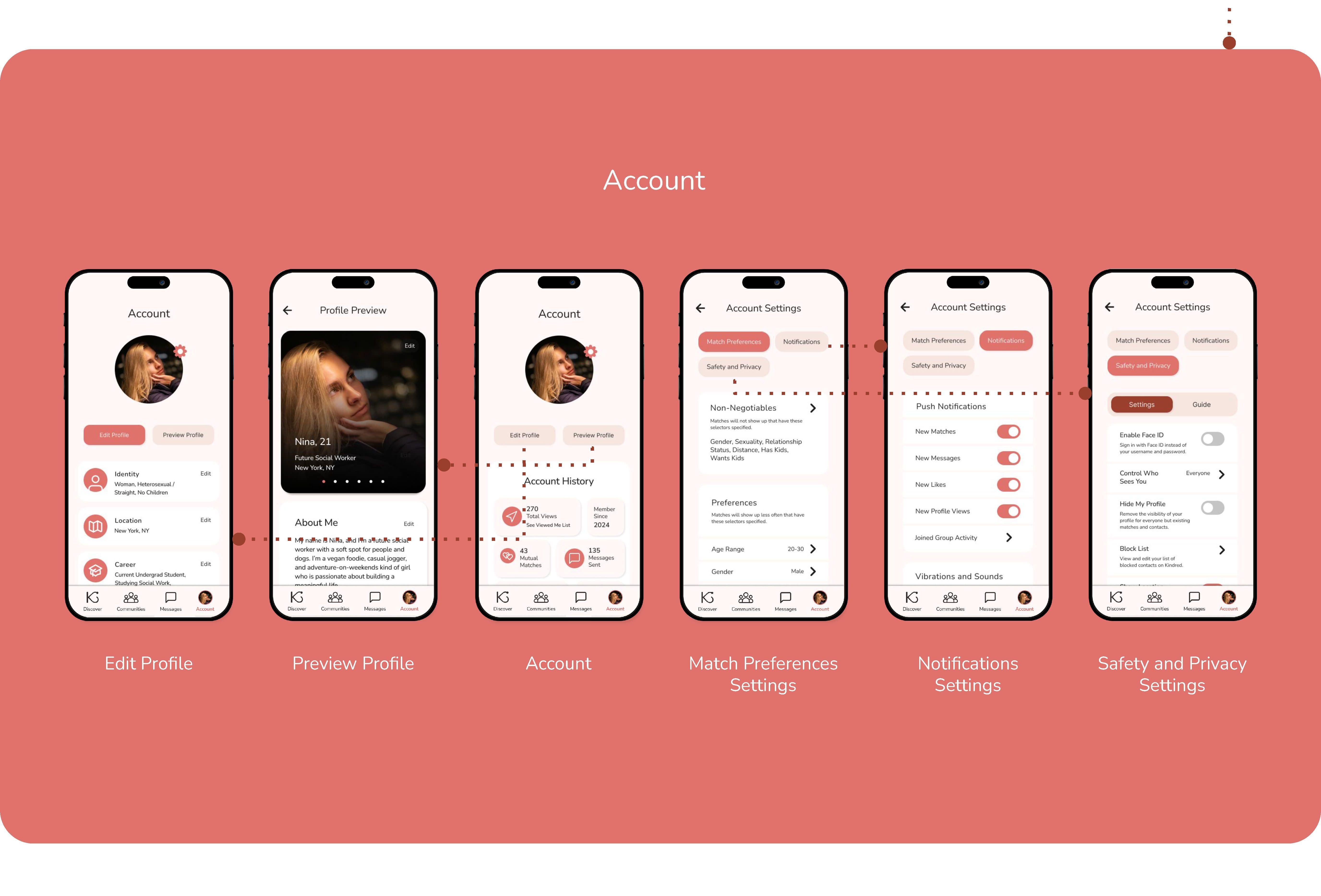
Users have the option to message others via text or voice memos, or make video calls with or without live captions.
GOING FORWARD
Takeaways
User Feedback:
“This app is well-developed, and the community section makes it stand out from other apps. I am not a fan of dating apps, but I do like this one, especially because of this particular section.”
“I would give this app a try because the search feature is really unique and not something I have seen on any other dating apps.”
What I Learned:
This project was my introduction to the design thinking framework and using Figma to create wireframes and prototypes. My experience with this project emphasized the importance of usability studies and design iterations.
GOING FORWARD